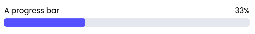
Fields
| Name | Type | Description | Options |
|---|---|---|---|
| Label | Text | - | - |
| Value | Number | - | - |
| Minimum value | Number | - | - |
| Maximum value | Number | - | - |
| Display percentage | Boolean | - | - |
| Accent | Color | - | - |
| Primary text | Color | - | - |
| Separator | Color | - | - |
| Custom CSS classes | Text | CSS classes, separated by spaces. You can define classes in custom stylesheets. | - |
Events
wf-click
wf-click
Triggered when the Progress bar is clicked.