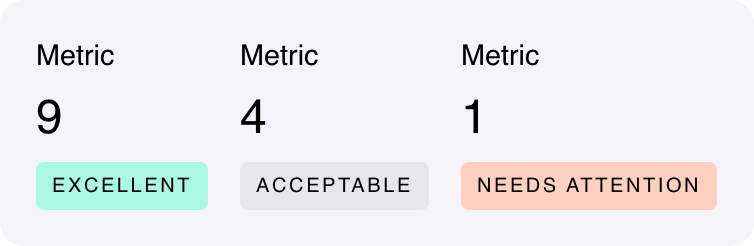
A component that prominently displays a metric value and associated information.

Fields

NameTypeDescriptionOptions
NameText
    ValueTextThe main value to be displayed. It’s not limited to numbers.
      DescriptionText
        NoteTextPrefix with ’+’ for a positive message, with ’-’ for a negative message.
          Primary textColor
            Secondary textColor
              PositiveColor
                NeutralColor
                  NegativeColor
                    Custom CSS classesTextCSS classes, separated by spaces. You can define classes in custom stylesheets.

                      Low code usage

                      This component can be declared directly in Python, using backend-driven UI.

                      ui.Metric(content={
                              "name": "", # str 
                              "metricValue": "", # str 
                              "description": "", # str 
                              "note": "", # str 
                              "primaryTextColor": "", # str 
                              "secondaryTextColor": "", # str 
                              "positiveColor": "", # str 
                              "neutralColor": "", # str 
                              "negativeColor": "", # str 
                              "cssClasses": "", # str 
                          }
                      )
                      

                      Reference