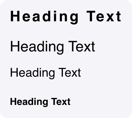
A text component used to display headings or titles in different sizes and styles.

Fields

NameTypeDescriptionOptions
TextTextAdd text directly, or reference state elements with @.
    Heading typeText
    1. h1 (Big)
    2. h2 (Normal)
    3. h3 (Small)
    4. h4 (Smallest)
    AlignmentText
    1. Left
    2. Center
    3. Right
    Primary textColor
      Custom CSS classesTextCSS classes, separated by spaces. You can define classes in custom stylesheets.

        Low code usage

        This component can be declared directly in Python, using backend-driven UI.

        ui.Heading(content={
                "text": "", # str 
                "headingType": "h3", # str [h1, h2, h3, h4]
                "alignment": "left", # str [left, center, right]
                "primaryTextColor": "", # str 
                "cssClasses": "", # str 
            }
        )
        

        Reference