Overview
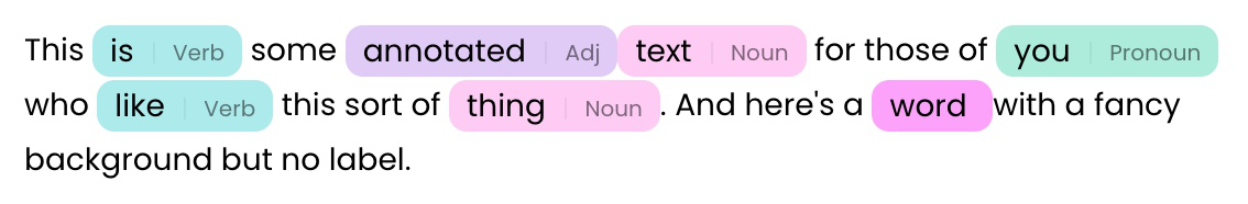
The Annotated Text component displays text with visual annotations and highlights. It allows users to see text with embedded annotations that are color-coded to distinguish different types of content or sections. Annotated text is essential for educational content, document review systems, and any interface where text needs visual distinction between different types of content. It provides a way to highlight important terms and sections without cluttering the main display.Common use cases
- Educational content: Provide explanations and definitions for complex terms
- Document review: Show comments, suggestions, and feedback on text
- Code documentation: Highlight and explain code snippets with annotations
- Research papers: Show citations, references, and additional context
- Legal documents: Display legal annotations and explanations
How it works
- Text content: Displays the main text content with embedded annotations
- Annotation markers: Shows visual indicators for annotated sections
- Styling: Customize appearance of annotations and text with colors and CSS classes
Configuration options
Basic settings
- Annotated text: The main text with embedded annotation markers, must be a JSON string or a state reference to an array
Advanced settings
- Enable markdown: Adds markdown support for automatically sanitizing unsafe elements
- Enable copy buttons: Adds a control bar with both copy text and JSON buttons
- Rotate hue: Rotates the hue of annotated text colors depending on the content of the string
Styling options
- Text color: Set the color of the main text
- Annotation colors: Set colors for different annotation types
- Custom CSS classes: Apply additional styling
Example
Contract review and analysis
This example shows how to create a contract review interface with highlighted terms and clauses. Interface:- File input component for file upload
- Annotated text component for annotated contract content
- Annotated text: JSON array containing contract text with embedded annotations in the format
["text", ["highlighted term", "label"], "more text"]
Best practices
- Clear annotations: Make annotation content concise and informative
- Visual indicators: Use clear visual cues to show where annotations exist
- Performance: Limit the number of annotations to avoid overwhelming users
- Consistent styling: Use consistent annotation styling throughout your interface
- Context relevance: Ensure annotations provide relevant and helpful information
Fields
| Name | Type | Description | Options |
|---|---|---|---|
| Annotated text | Object | Value array with text/annotations. Must be a JSON string or a state reference to an array. | - |
| Reference | Color | The colour to be used as reference for chroma and luminance, and as the starting point for hue rotation. | - |
| Seed value | Number | Choose a different value to reshuffle colours. | - |
| Rotate hue | Boolean | If active, rotates the hue depending on the content of the string. If turned off, the reference colour is always used. | - |
| Enable markdown | Boolean | If active, the output will be sanitized; unsafe elements will be removed. | - |
| Enable copy button | Boolean | Enable a copy button that lets users to copy the contents in this field to their clipboard | - |
| Button | Color | - | - |
| Button text | Color | - | - |
| Primary text | Color | - | - |
| Custom CSS classes | Text | CSS classes, separated by spaces. You can define classes in custom stylesheets. | - |