Overview
The Message component displays status messages, notifications, and feedback to users. It uses prefix characters to determine the message type and styling automatically. Message components support different types (success, error, warning, loading, info) with appropriate styling and can display dynamic content from state variables. They’re essential for creating responsive, user-friendly interfaces that keep users informed.Common use cases
- Status updates: Show progress messages during processing operations
- Error notifications: Display validation errors or system failures
- Success confirmations: Confirm successful actions or completions
- Loading states: Show animated loading messages during operations
- Form validation: Display field validation errors and warnings
How it works
- Message content: Display static text or reference state variables
- Prefix-based types: Use prefix characters to determine message type automatically. For example,
+makes the message green,-makes it red, and%provides a dynamic loading icon. - Dynamic updates: Content updates automatically when state variables change
- Visual styling: Each message type has distinct colors and styling
- Conditional display: Messages can show or hide based on conditions
Configuration options
Basic settings
- Message: The text content to display (supports state variable references)
- Prefix characters: Use prefixes to determine message type automatically. For example,
+in front of the message makes it green:+Operation completed successfully.
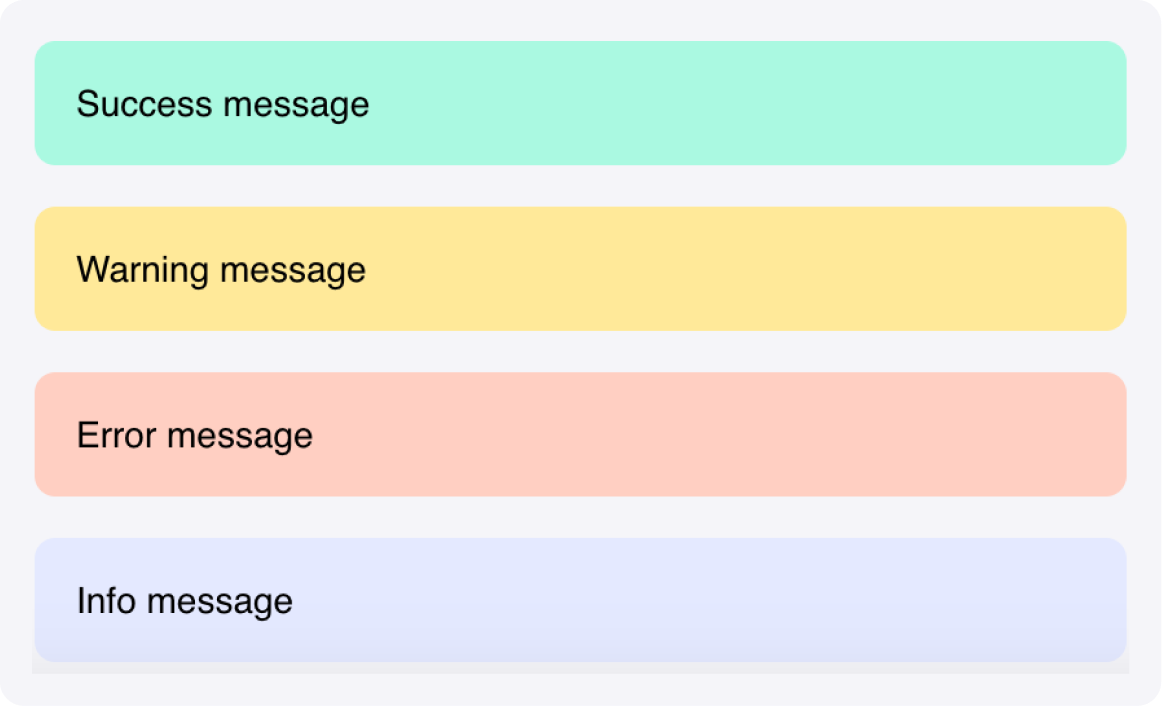
Message types and prefixes
- Success: Prefix with
+(for example,"+Operation completed successfully") - Error: Prefix with
-(for example,"-An error occurred") - Warning: Prefix with
!(for example,"!Please check your input") - Loading: Prefix with
%(for example,"%Processing your request...") - Info: No prefix (for example,
"This is an informational message")
Styling options
- Success color: Customize success message background color (default: Green3)
- Error color: Customize error message background color (default: Orange2)
- Warning color: Customize warning message background color (default: #FFE999)
- Info color: Customize info message background color (default: Blue2)
- Loading color: Customize loading message background color (default: Blue2)
- Primary text color: Set the text color
- Custom CSS classes: Apply additional styling
Example
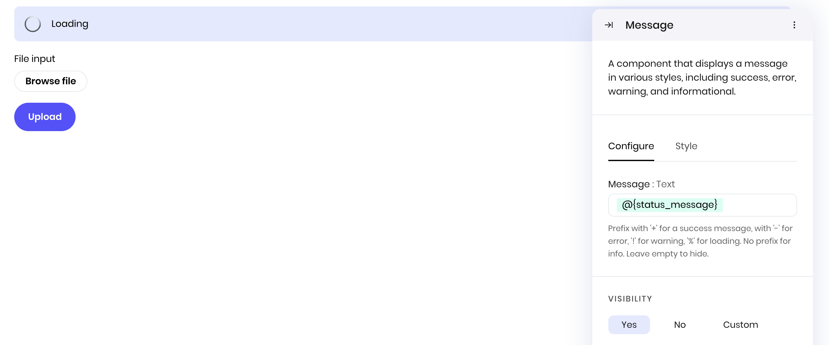
Processing status updates
Create a workflow that shows different status messages during file processing. Interface:- File input to upload a file
- Button component to start file processing
- Message component for status updates
- Message:
@{status_message}(with%prefix for loading,+for success,-for errors)
Best practices
- Clear messaging: Use concise, clear language that users can understand immediately
- Appropriate types: Choose the correct message type for the content (info, success, warning, error)
- Dynamic content: Use state variables to show relevant, up-to-date information
- Conditional display: Show messages only when relevant to avoid interface clutter
- Consistent styling: Maintain consistent message styling across your interface
- Context: Provide enough context for users to understand and act on the message
Fields
| Name | Type | Description | Options |
|---|---|---|---|
| Message | Text | Prefix with ’+’ for a success message, with ’-’ for error, ’!’ for warning, ’%’ for loading. No prefix for info. Leave empty to hide. | - |
| Success | Color | - | - |
| Error | Color | - | - |
| Warning | Color | - | - |
| Info | Color | - | - |
| Loading | Color | - | - |
| Primary text | Color | - | - |
| Custom CSS classes | Text | CSS classes, separated by spaces. You can define classes in custom stylesheets. | - |