Overview
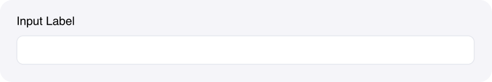
The Text Input component allows users to enter single-line text values. It’s the most basic form of user input and is essential for collecting information from users in your agent. Text inputs automatically bind to state variables, making it easy to capture and use user input in your blueprint workflows. They support various styling options and can be configured for different use cases, including password fields.Common use cases
- User information: Collect names, emails, phone numbers, and other personal data
- Search queries: Allow users to search through data or content
- Configuration values: Let users set preferences or parameters
- Form fields: Collect data as part of larger forms
- Password entry: Secure input for sensitive information
How it works
- Label: Provide a clear label for the input field
- Placeholder: Add helpful placeholder text to guide users
- Binding: Connect to a state variable to store the input value
- Events: Trigger workflows when users type or finish editing
- Styling: Customize appearance with colors and CSS classes, and add a password mode for sensitive information
Configuration options
Basic settings
- Label: The field label displayed above the input
- Placeholder: Hint text shown when the field is empty
- Link variable: The name of the state variable that stores the input value
Styling options
- Password mode: Toggle to hide input for sensitive data (default is disabled)
- Accent color: Set the focus color for the input field
- Custom CSS classes: Apply additional styling
Events
- wf-change: Triggered as users type (real-time) - payload contains the input value
- wf-change-finish: Triggered when users finish editing (on blur) - payload contains the input value
Example
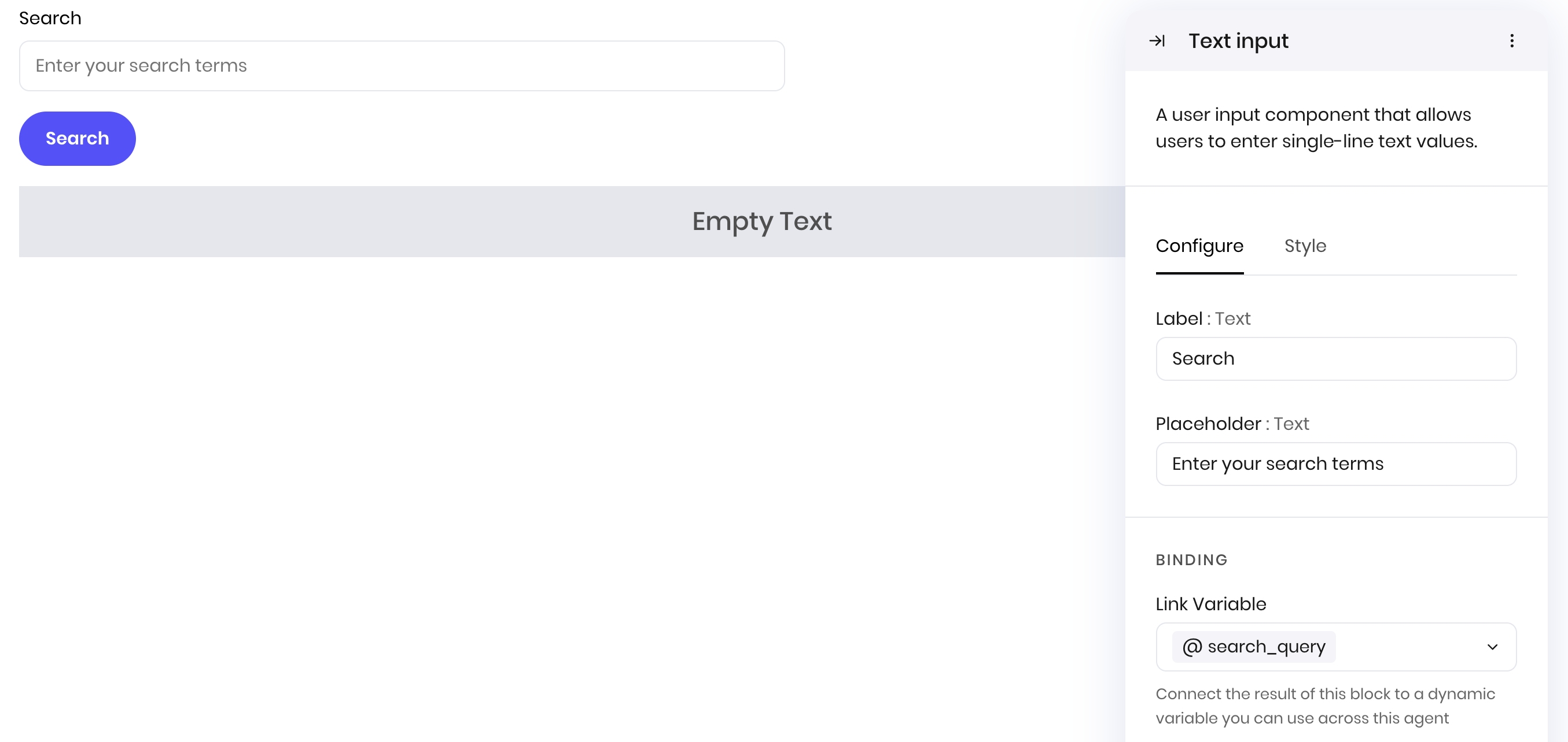
Search interface
This example shows how to create a search interface with a text input. The search query is stored in thesearch_query state variable. For the blueprint workflow, you can access the search_query state variable to see the user’s query.
Interface:
- Text Input component for the search query
- Button component to trigger the search
- Results container to display matches
- Label: “Search”
- Placeholder: “Enter search terms…”
- Link variable:
search_query
Best practices
- Clear labels: Use descriptive labels that clearly indicate what information is needed
- Helpful placeholders: Provide examples or guidance in placeholder text
- Appropriate validation: Validate input on both client and server side
- Real-time feedback: Use the
wf-changeevent for immediate user feedback - Password security: Use password mode for sensitive information
Fields
| Name | Type | Description | Options |
|---|---|---|---|
| Label | Text | - | - |
| Placeholder | Text | - | - |
| Password mode | Boolean | - | - |
| Accent | Color | - | - |
| Custom CSS classes | Text | CSS classes, separated by spaces. You can define classes in custom stylesheets. | - |