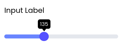
A user input component that allows users to select numeric values using a slider with optional constraints like min, max, and step.

Fields

NameTypeDescriptionOptions
LabelText--
Minimum valueNumber--
Maximum valueNumber--
Step sizeNumber--
AccentColor--
Popover colorColor--
Popover backgroundColor--
Custom CSS classesTextCSS classes, separated by spaces. You can define classes in custom stylesheets.-

Events

Low code usage

This component can be declared directly in Python, using backend-driven UI.

ui.SliderInput(content={
        "label": "", # str 
        "minValue": 0.0, # Union[float, str] 
        "maxValue": 0.0, # Union[float, str] 
        "stepSize": 0.0, # Union[float, str] 
        "accentColor": "", # str 
        "popoverColor": "", # str 
        "popoverBackgroundColor": "", # str 
        "cssClasses": "", # str 
    },
    handlers={
        "wf-number-change": handle_event,
    }
)

A function, in this example handle_event, should be implemented in your code to handle events.

def handle_event(state, payload, context, ui):
  pass

Reference