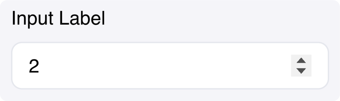
Fields
| Name | Type | Description | Options |
|---|---|---|---|
| Label | Text | - | - |
| Placeholder | Text | - | - |
| Minimum value | Number | - | - |
| Max value | Number | - | - |
| Step | Number | - | - |
| Custom CSS classes | Text | CSS classes, separated by spaces. You can define classes in custom stylesheets. | - |
Events
wf-number-change
wf-number-change
Capture changes as they happen.
wf-number-change-finish
wf-number-change-finish
Capture changes once this control has lost focus.