Overview
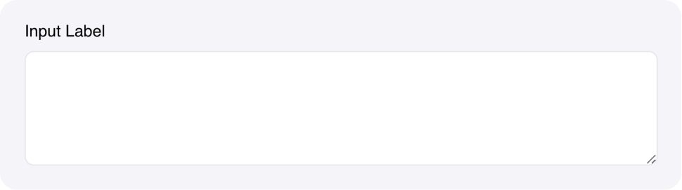
The Text area Input component allows users to enter multi-line text values. It’s designed for longer text content like descriptions, comments, reviews, or any content that requires multiple lines.Common use cases
- Long-form content: Collect essays, articles, or detailed descriptions
- User feedback: Gather reviews, comments, or support requests
- Data entry: Allow users to paste large amounts of text or data
- Configuration: Collect complex configuration settings or parameters
How it works
- Multi-line input: Users can enter text across multiple lines
- Manual resizing: Users can resize the text area by dragging the bottom corner
- State binding: Content automatically saves to the specified state variable
- Real-time events: Triggers events as users type or finish editing
- Configurable rows: Set the initial number of rows to display
Configuration options
Basic settings
- Label: Text label displayed above the input field
- Placeholder: Hint text shown when the field is empty
- Rows: Number of rows to display (default:
5) - Link variable: The name of the state variable that stores the input value
Styling options
- Custom CSS classes: Apply additional styling
Events
- wf-change: Triggered as users type (real-time) - payload contains the text area content
- wf-change-finish: Triggered when users finish editing (on blur) - payload contains the text area content
Example
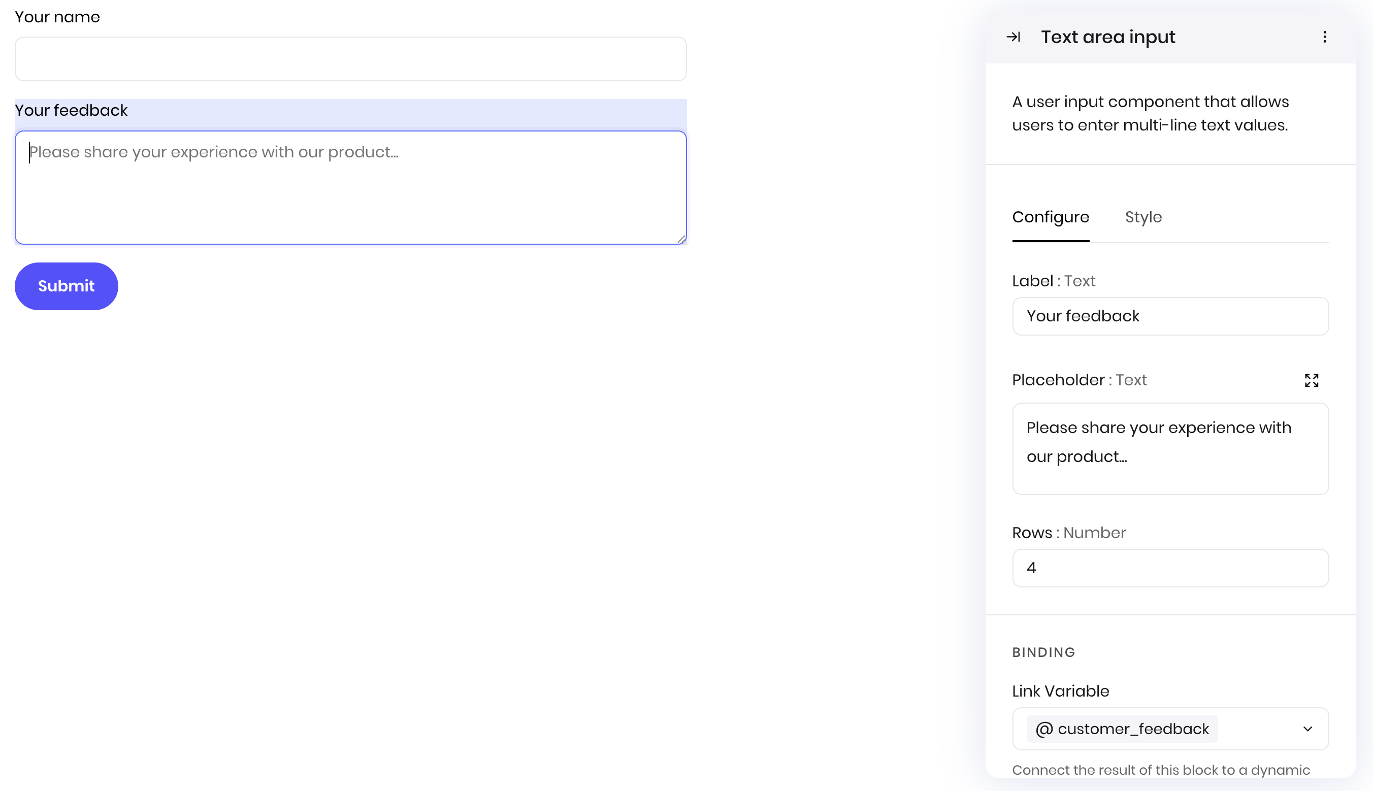
Customer feedback form
This example shows how to create a customer feedback form with a text area for detailed comments. Interface:- Text Input for customer name
- Text area Input for feedback details
- Button to submit the form
- Label: “Your feedback”
- Placeholder: “Please share your experience with our product…”
- State element:
customer_feedback - Rows: 4
Fields
| Name | Type | Description | Options |
|---|---|---|---|
| Label | Text | - | - |
| Placeholder | Text | - | - |
| Rows | Number | - | - |
| Custom CSS classes | Text | CSS classes, separated by spaces. You can define classes in custom stylesheets. | - |