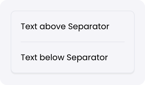
A visual component to create a separation between adjacent elements.Documentation Index
Fetch the complete documentation index at: https://dev.writer.com/llms.txt
Use this file to discover all available pages before exploring further.

Fields
| Name | Type | Description | Options |
|---|---|---|---|
| Separator | Color | - | - |
| Custom CSS classes | Text | CSS classes, separated by spaces. You can define classes in custom stylesheets. | - |