Overview
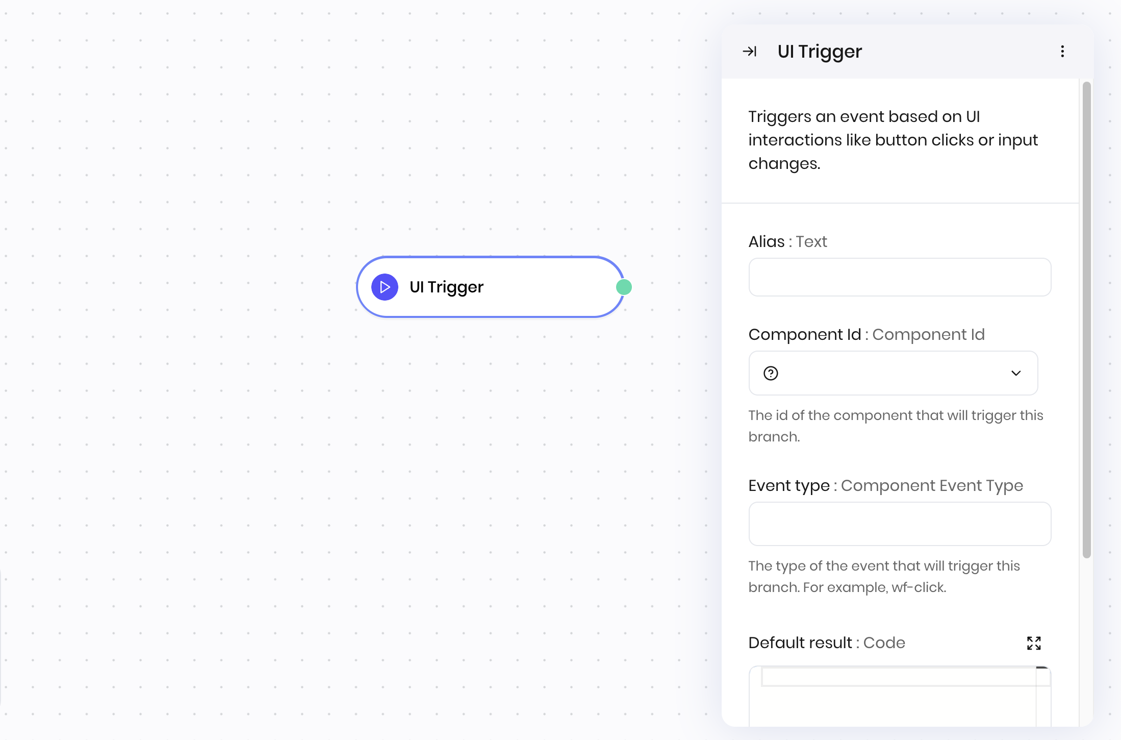
The UI Trigger block is the starting point for your blueprint if users interact with the agent’s interface. It starts a workflow in response to a user action in the UI, such as clicking a button or typing in a text area. Use it to connect frontend events to backend logic in your blueprint. You can specify the event to listen for and any parameters to pass to the workflow.How it works
- Component Id: Select the UI component that triggers this workflow; for example, a button click or chatbot message.
- Event type: Specify the type of event to listen for; for example, clicks (
wf-click) or text area changes (wf-change). - Default result: Optionally provide a default result when testing the blueprint from the “Run blueprint” button. This is useful for testing the workflow without having to interact with the interface. The default result should match the expected payload format for the selected event type. For example:
- For a button click (
wf-click), provide an object with modifier key states, like: - For a text input change (
wf-change), provide the expected text value, like"Sample text" - For a file upload (
wf-file-change), provide an array of file objects, like:
- For a button click (
@{payload} in subsequent blocks.
Examples
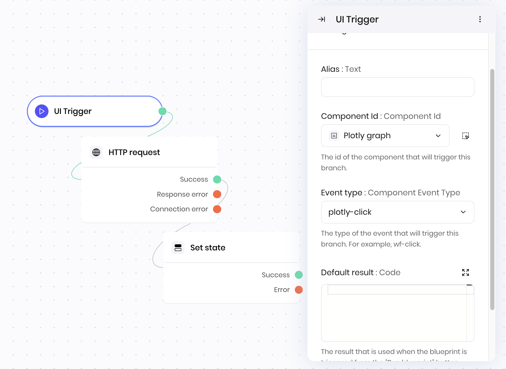
Interactive dashboard updates
This example demonstrates how to handle real-time dashboard interactions and updates. Interface:- A Plotly chart that a user can click to trigger the workflow.
- UI Trigger → User clicks on dashboard widget
- HTTP Request → Fetches updated data from external API
- Set state → Updates dashboard state
- Component Id: Dashboard widget component
- Event type:
wf-click - Default result: Optional, but useful for testing the blueprint from the “Run blueprint” button. The default result below mimics the data that would be returned if a user clicked somewhere on a Plotly chart in the interface.
Fields
| Name | Type | Control | Default | Description | Options | Validation |
|---|---|---|---|---|---|---|
| Component Id | Component Id | - | - | The id of the component that will trigger this branch. | uiComponentsWithEvents | - |
| Event type | Component Event Type | - | - | The type of the event that will trigger this branch. For example, wf-click. | eventTypes | - |
| Default result | Code | - | - | The result that is used when the blueprint is triggered from the “Run blueprint” button | - | - |
End states
Below are the possible end states of the block call.| Name | Field | Type | Description |
|---|---|---|---|
| Trigger | - | success | - |
wf-file-change for a File input block, the payload contains the file that the user uploaded. You can access this value in any block in the blueprint as @{payload}.