Setting up your project
Creating a Writer app and getting your API key
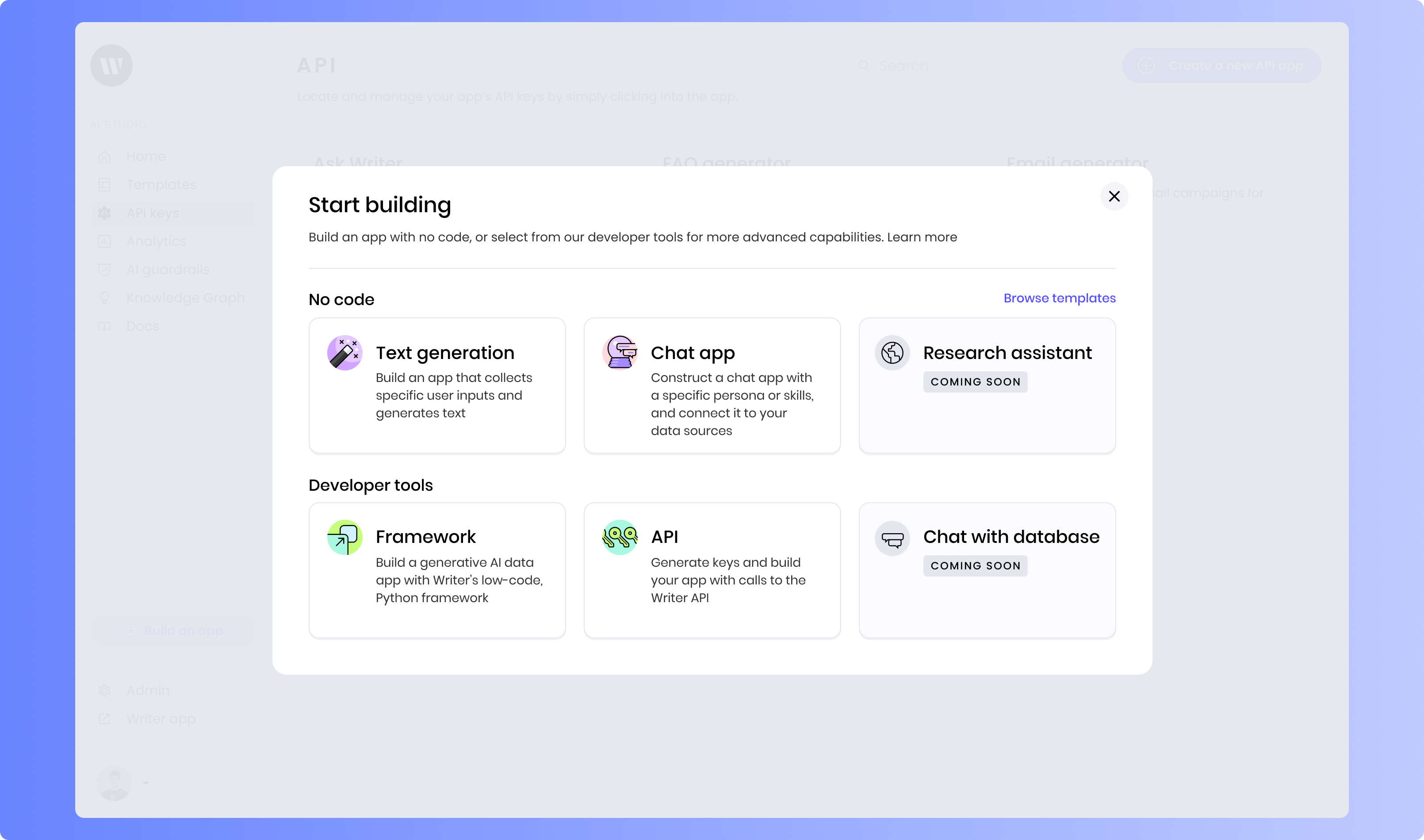
From the Home screen, click on Build an app.
Creating the application
Next, open your terminal and navigate to the directory where you want to create your application directory.Set the API key environment variable
WRITER_API_KEY. Here’s how you can set this variable in your terminal session:Clone the application
framework-tutorials repo and navigate to the folder containing the starting point for this application.Edit your project
localhost:4005. If this port is in use, you can specify a different port. Open this address in your browser to view your default application setup.Introduction to the application setup
The template includes some basic code, UI setup, and files to help you get started.Included files
The filesprompts.py and html_template.py contain helper functions for generating prompts for the AI model and formatting the output HTML, respectively.
In the sample-input folder, you’ll find a sample CSV file that you can use to test the application.
Finally, the custom.css file in the static folder contains custom CSS styles for the application.
Dependency imports
Inmain.py, you’ll see that the dependencies are already imported at the top:
Initial UI
The template includes a basic UI setup, including a Page component with a Header component. The Header component also includes an Image. If you want to change the logo image, you can replace thelogo_image_path variable in the state with the path to your desired image in the static folder.
Initializing the application state
First, inmain.py, set up the initial state for the application. This state will store the application’s title, logo image path, file data, metrics, and processing status for each step. You’ll also import a custom CSS file to style the application and create a placeholder DataFrame.
Create initial DataFrame
wf.init_state:Initialize state
main.py:Import custom CSS
Building the file upload functionality
First, you’ll build the file upload feature. Note thatprompts.py, html_template.py, and custom.css are provided in the starting point for the application. There is also a sample CSV file in the sample-input folder that you can use to test the application.
Implementing the file upload handler
To handle file uploads, you’ll create a function inmain.py that reads the uploaded CSV file, processes the data, and stores it in the application state.
Implementing a file upload handler
main.py, create a function to handle file uploads. This function will read the uploaded CSV file, process the data, and store it in the application state.Create CSV to DataFrame converter
Displaying the uploaded CSV file
Next, you’ll display the uploaded CSV file in the application UI.Creating a Step Container
Create Step components
Configure first Step component
@{step1.completed}. This state reference will contain either “yes” or “no” based on the completion status of the step.Add Message component
@{step1.processing-message}. Scroll down to the Visibility section of the settings. Select “Custom” and set the condition to step1.processing-message.Create three-column layout
Add file input
wf-file-change handler to onchangefile_handler.Add generate button
@{step1.generate-button-state} and its “Icon” property to laps.Add Raw CSV section
Add DataFrame component
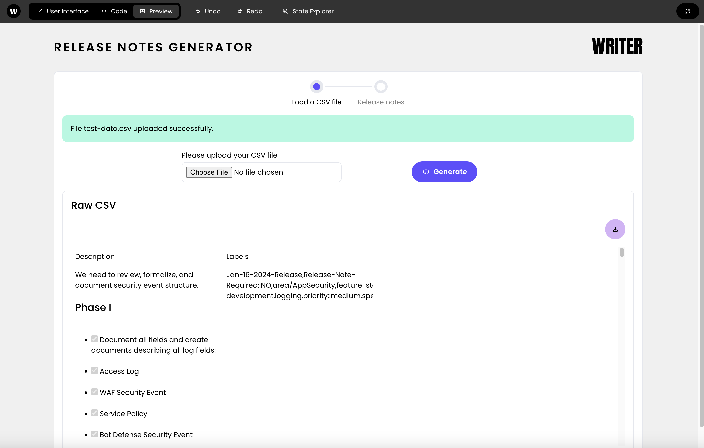
@{step1.raw_csv} as the data source. Toggle “Enable download,” “Use Markdown,” and “Wrap text” to “yes”. Set the Separator color to #d4b2f7 using the CSS tab.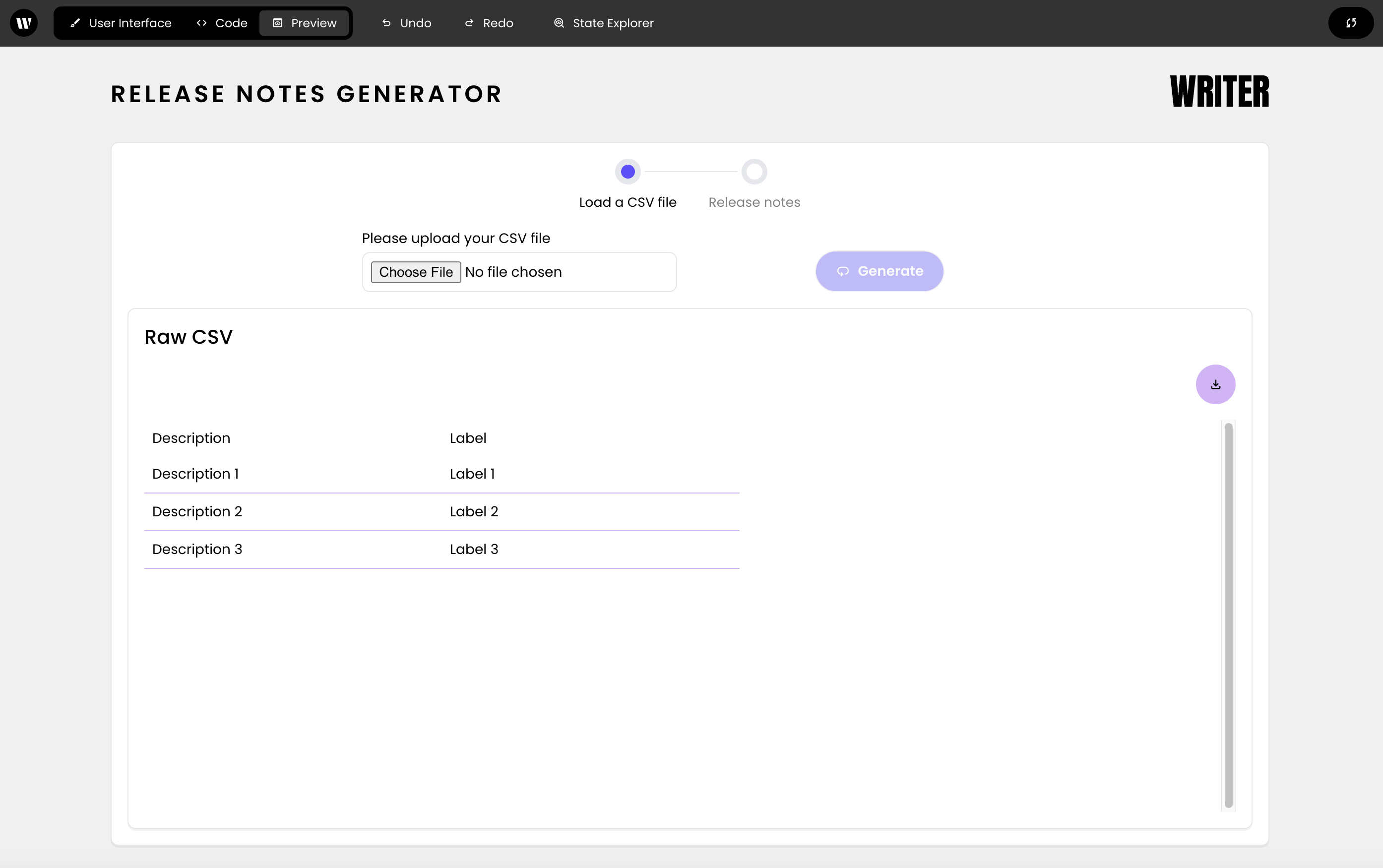
sample-input/test-data.csv, the Raw CSV section will display the uploaded CSV file:
Generating release notes
Now that you’ve set up the file upload functionality, you can generate release notes based on the uploaded CSV file.Defining text completion functions
Using the prompts provided, define functions to get the category, release notes summary, and release notes description using AI completion. You’ll use these functions to process the uploaded CSV file and generate release notes.Create category function
Create summary function
Create description function
Implementing the generate functionality
You’ll next implement the ability to process the CSV and generate release notes.Create category HTML
Create HTML file writer
Implement generate button handler
Bind button handler to Generate button
wf-click handler to handle_generate_button_click.Displaying the release notes
Now that you’ve generated the release notes, you can display them in the application UI.Implementing helper functions
Define helper functions to handle back button clicks, write HTML to a file and download the HTML file.Create back button handler
Create file download handler
Building the initial release notes UI
Next, you’ll build the UI for the “Release notes” step.Select 'Release notes' Step
Add Separator
Add Columns components
Add Back button
wf-click handler to handle_back_button_click. Set the “Icon” property to arrow_back.Buiding tabs for Release notes display
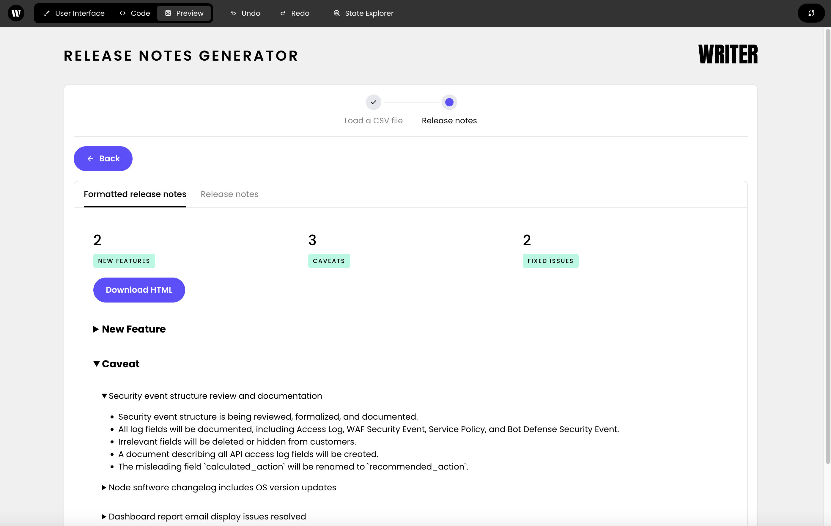
Below the Back button, add a Tab Container component and two Tab components. Name them “Formatted release notes” and “Release notes”.Formatted release notes tab
In the first tab, you’ll display the formatted release notes.Add HTML component
div and the “Styles” property to the following object:@{step2.formatted-release-notes}.Create three-column layout
Add Metric components
. Then, set the values of these components to @{metrics.new_features}, @{metrics.caveats}, and @{metrics.fixed_issues}. Finally, set the “Note” text to “+New Features”, “+Caveats”, and “+Fixed Issues” respectively. The ”+” sign will display styling that indicates a positive message.Add download button
download. Then, set the wf-click handler to handle_file_download.Release notes tab
Finally, you’ll add a Dataframe component to the second tab to display the detailed release notes.Add Metric component
@{metrics.total}. Delete the default value for “Note”.Add DataFrame component
@{step2.release-notes}. Configure it for text wrapping, downloading, and searching capabilities. Set the Separator color to #d4b2f7.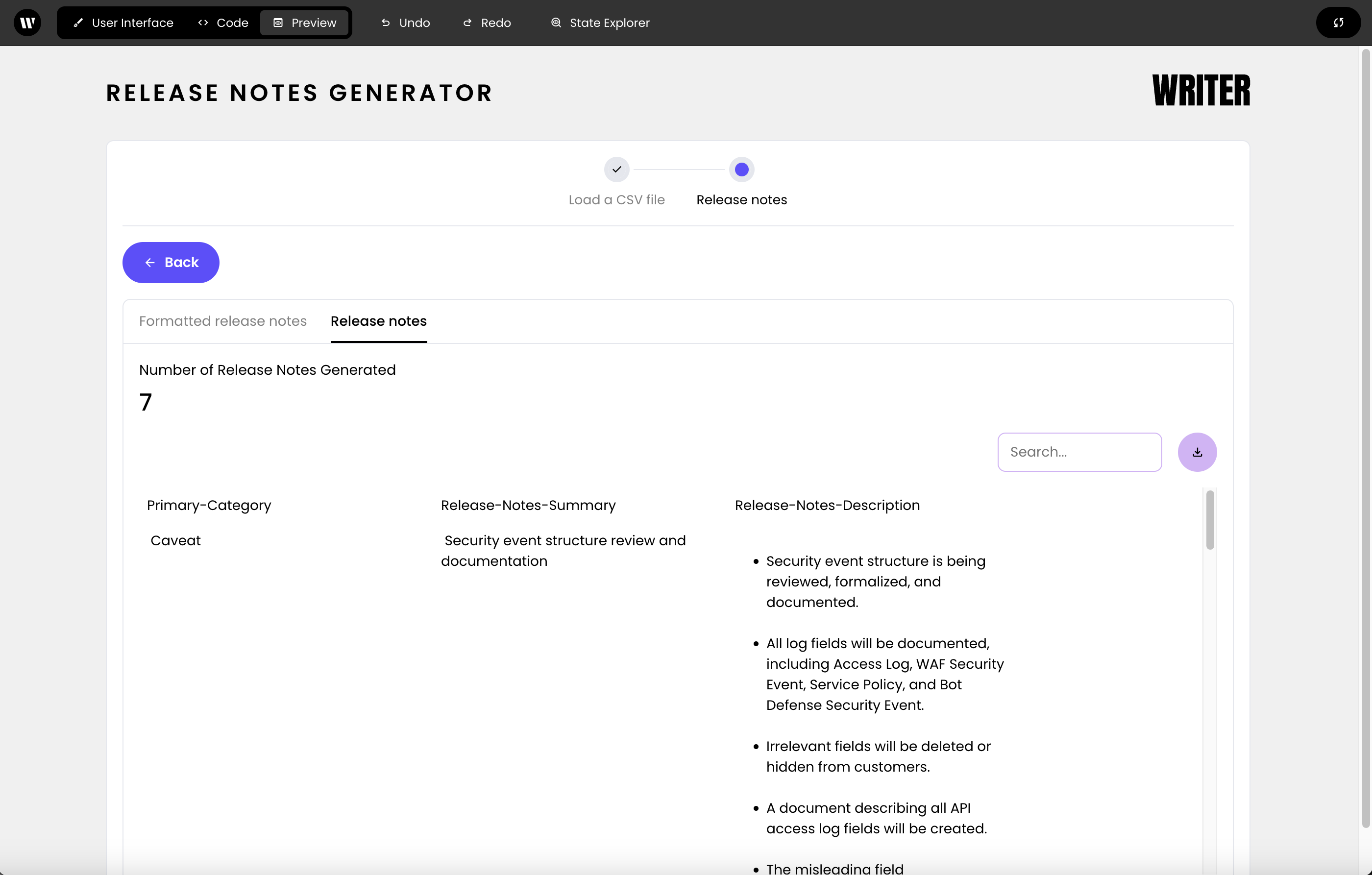
framework-tutorials/release-notes-generator/end in the tutorials repo you cloned at the beginning of the tutorial.