Writer Framework Builder’s modes
Writer Framework Builder has two modes:- UI mode: This is the default mode, which provides an overlay of tools for building and editing the user interface. The app still runs in UI mode, allowing to you test its functionality while you’re building it. You can also edit the app’s code and view its log.
- Preview mode: This mode lets you preview the application, experiencing it almost as your end users would. The tool overlay is hidden, but you can still edit the app’s code and view its log in this mode.
Building your app in UI mode
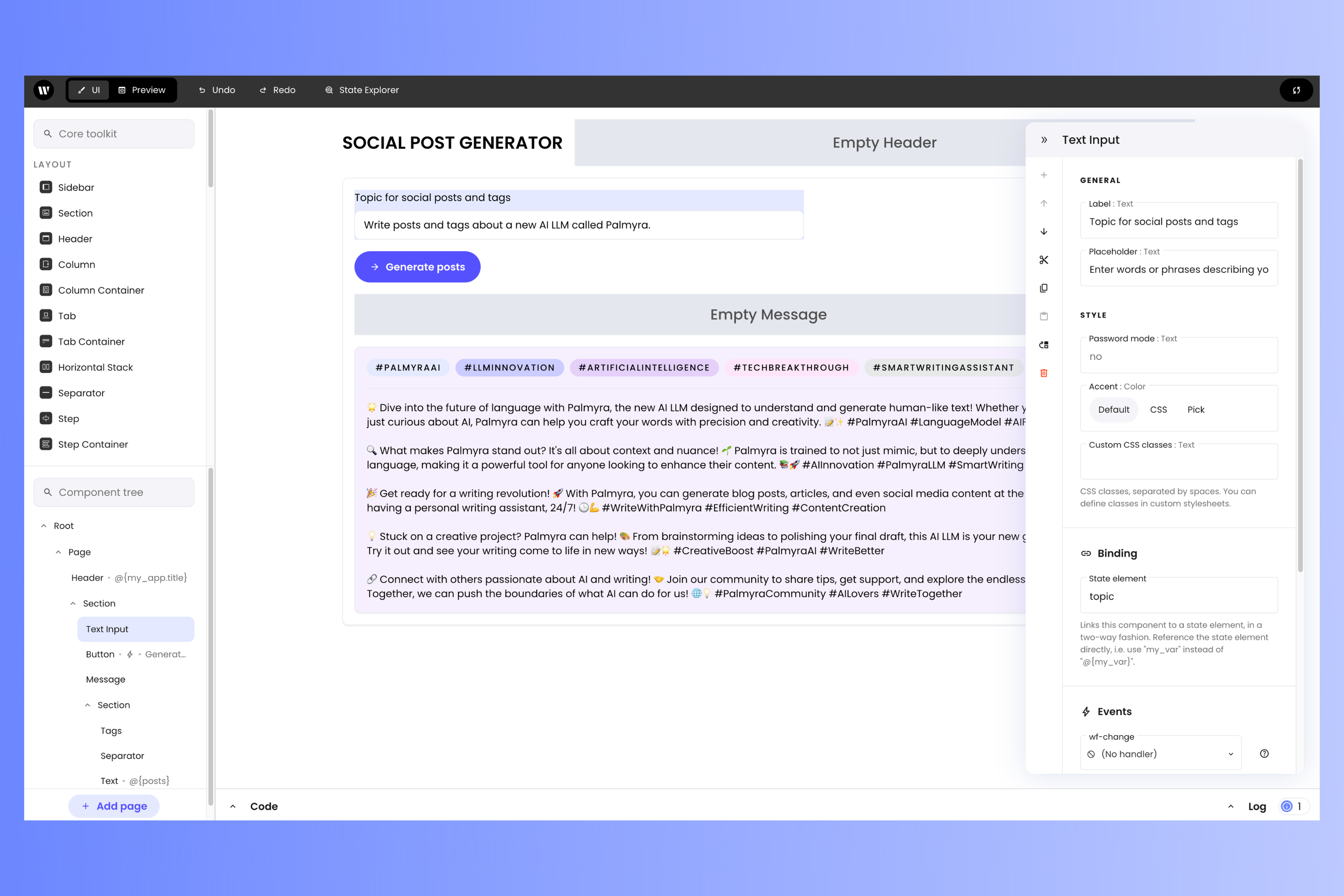
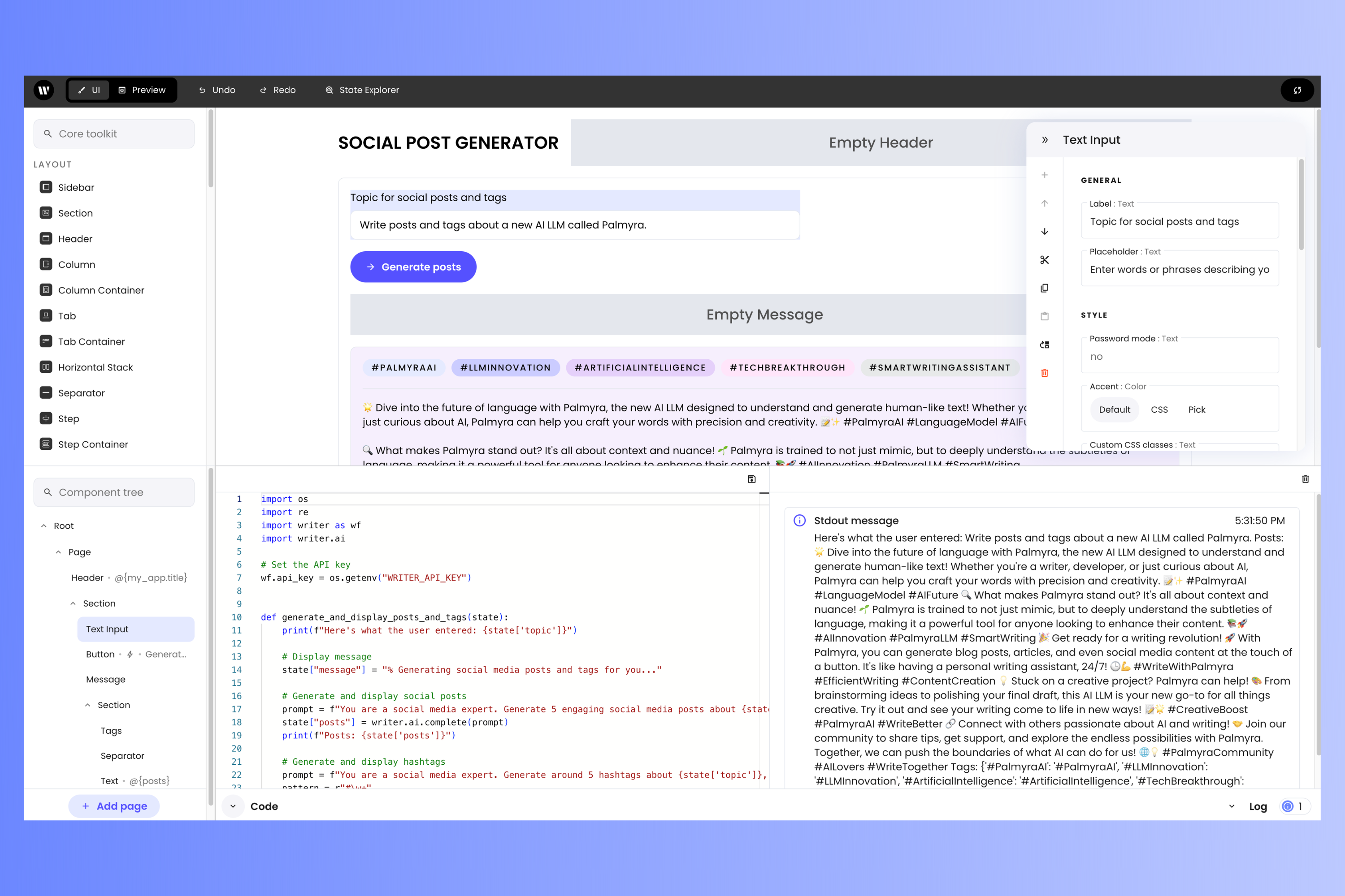
The different areas of UI mode
In UI mode, Writer Framework Builder’s page is divided into these areas: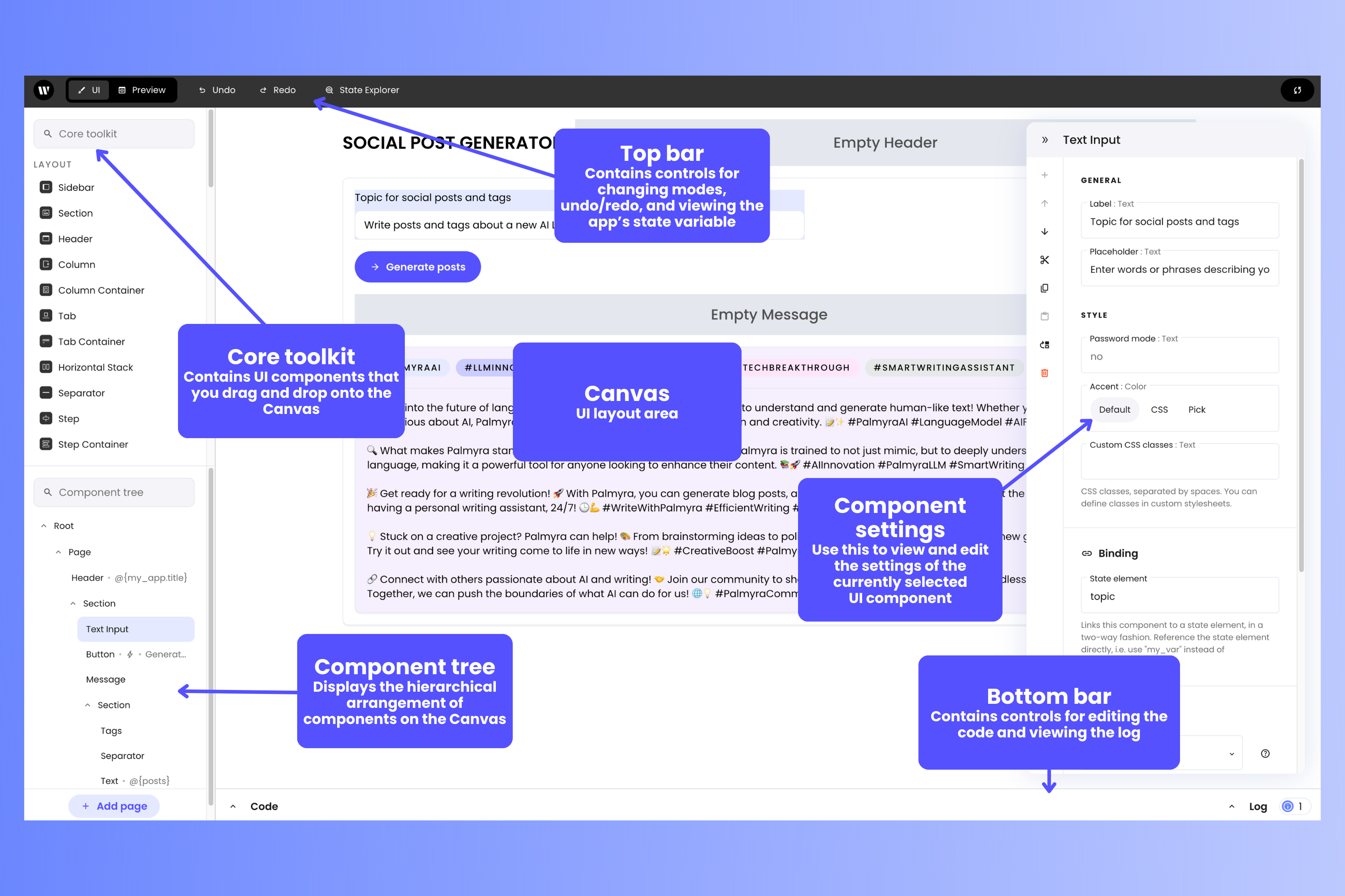
- Canvas: This is where you lay out components to build your app’s user interface. It displays the UI as your users will see it.
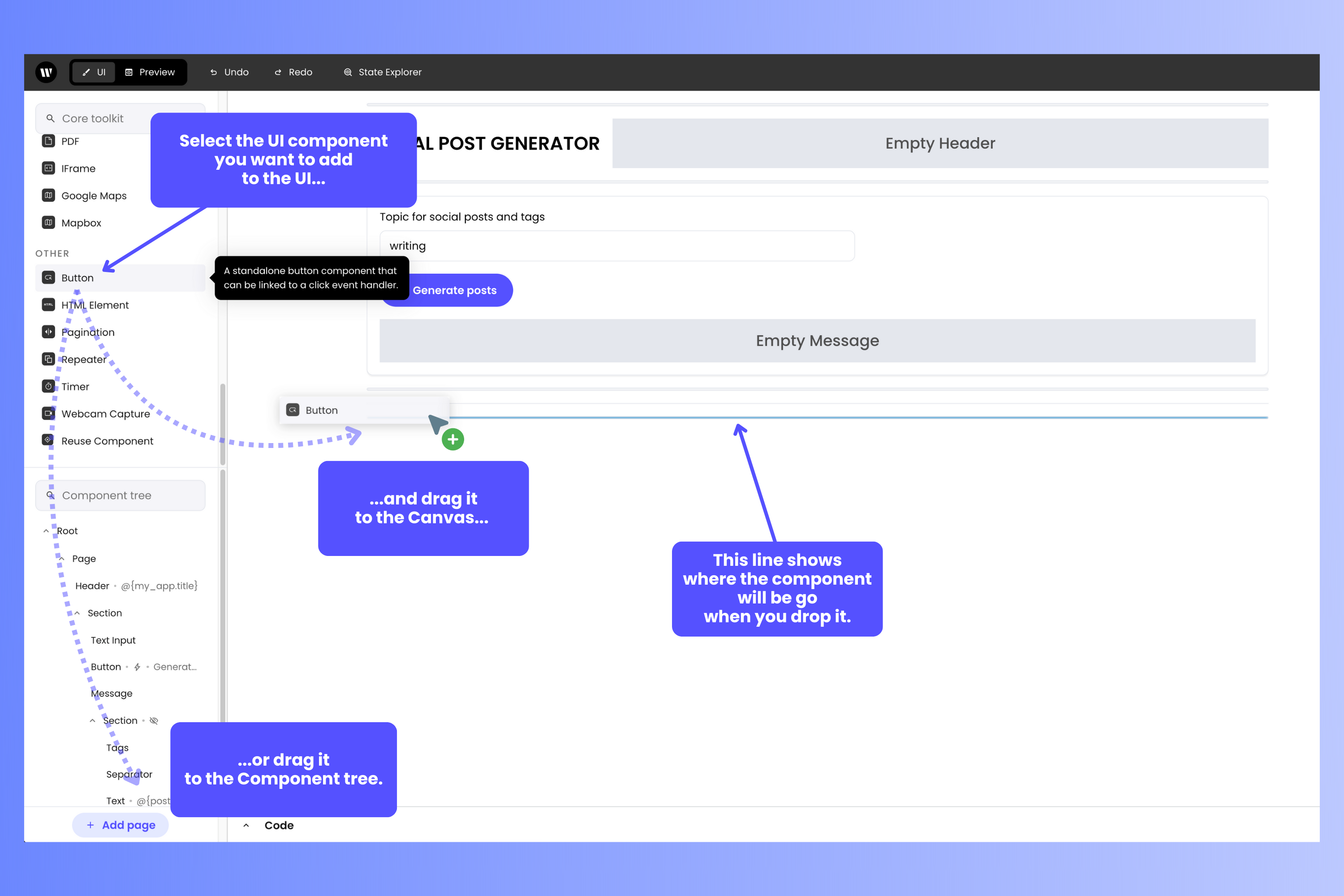
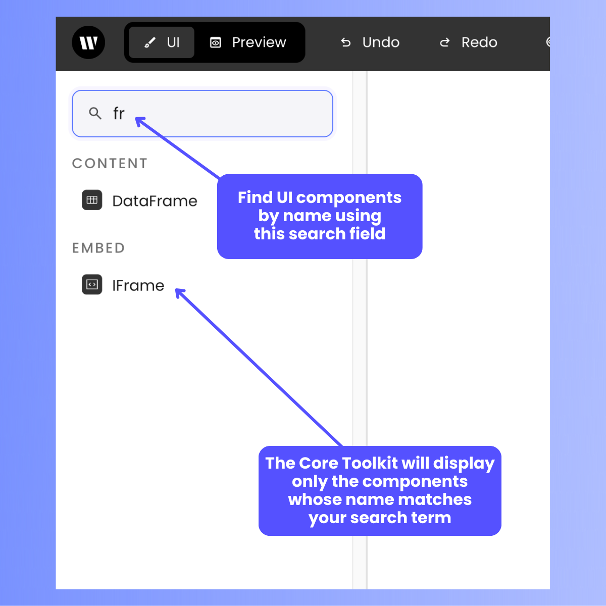
- Core toolkit: A “palette” of UI components that can be added to your app’s user interface. To add a component to your app’s UI, drag it onto the Canvas or into the Component tree.
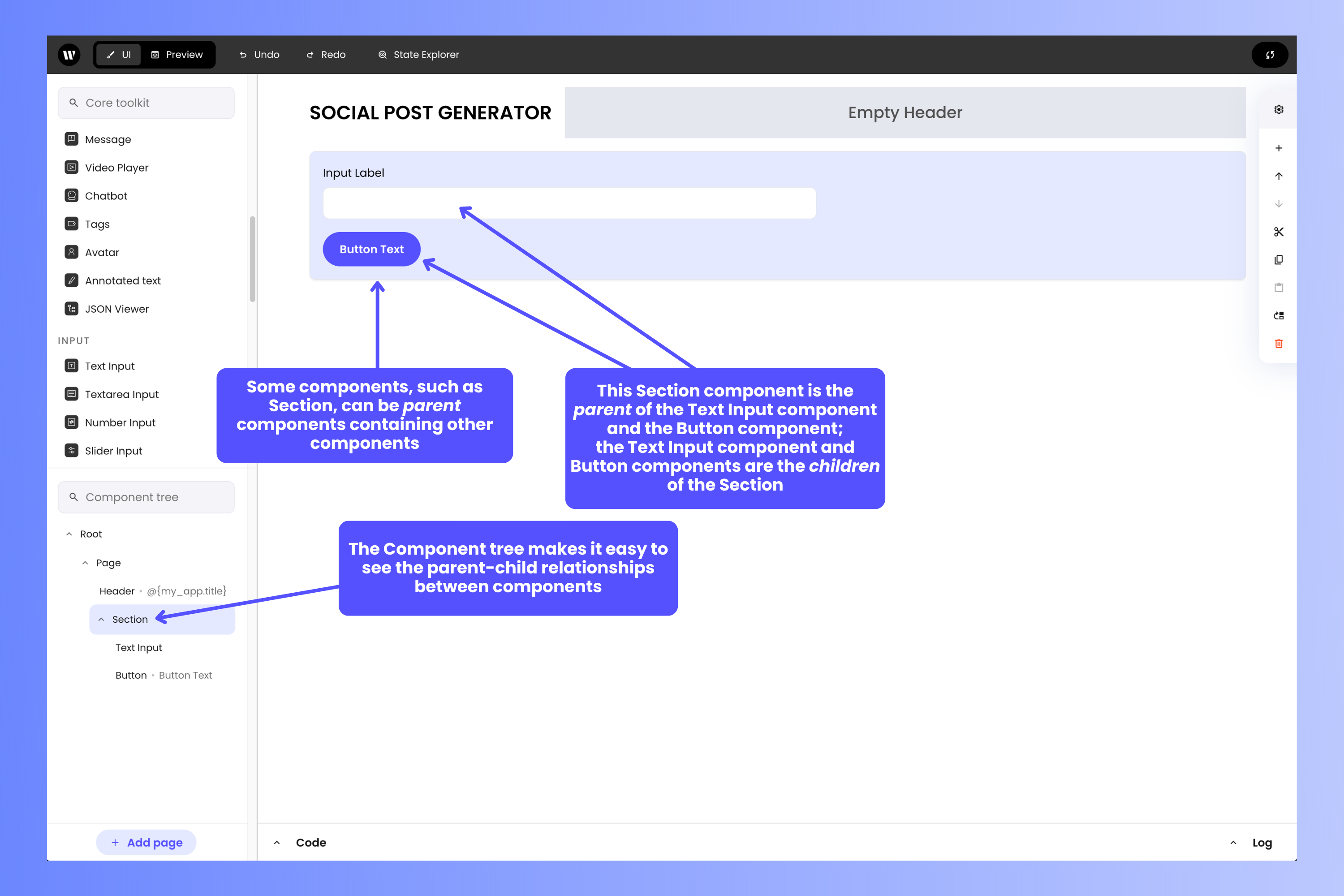
- Component tree: This provides an alternative way to view your app’s user interface: as a hierarchical tree structure. It’s useful for ensuring that UI components are located in the right place or in the correct container object, and is handy for selecting UI components in complex layouts.
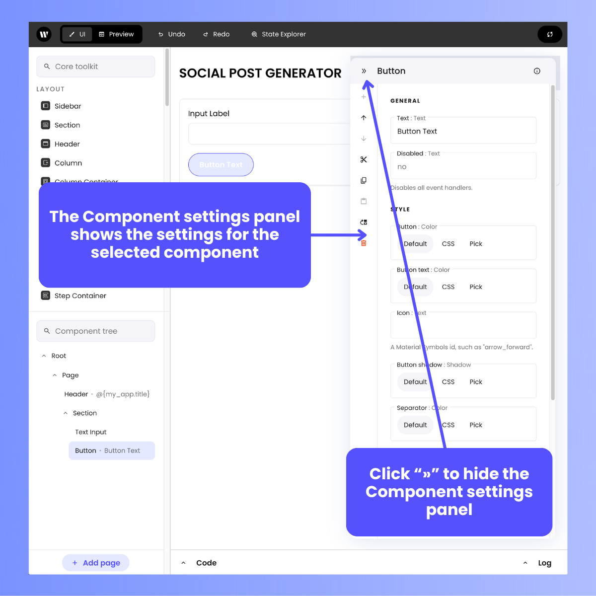
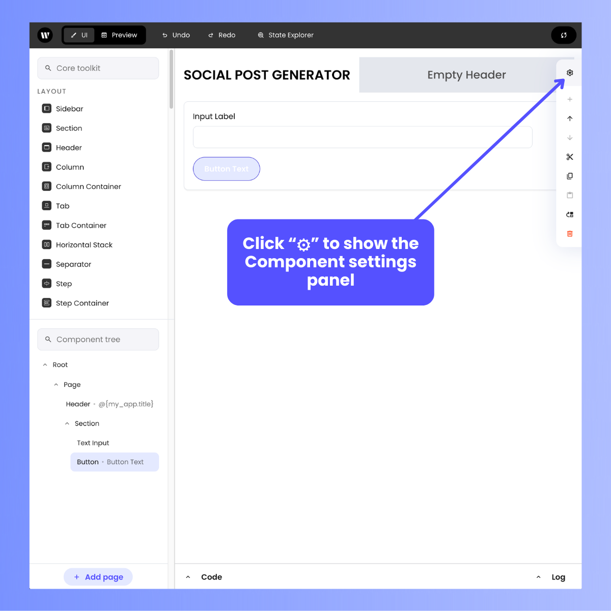
- Component settings: This panel lets you view and edit the settings for the currently selected UI component. You can hide the Component settings panel if you need more screen space to work on the Canvas.
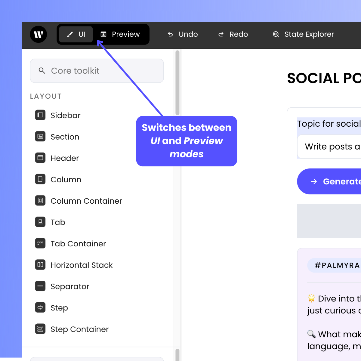
- Top bar: Contains the “high level” editing controls: switching between UI and Preview mode, undoing and redoing the most recent change to the UI, and viewing the application’s state.
- Bottom bar: Contains the “low level” editing controls, which toggle the Code and Log panels.
Defining your app’s user interface
Writer Framework Builder provides a selection of over 50 UI components that you can use to build your app’s user interface: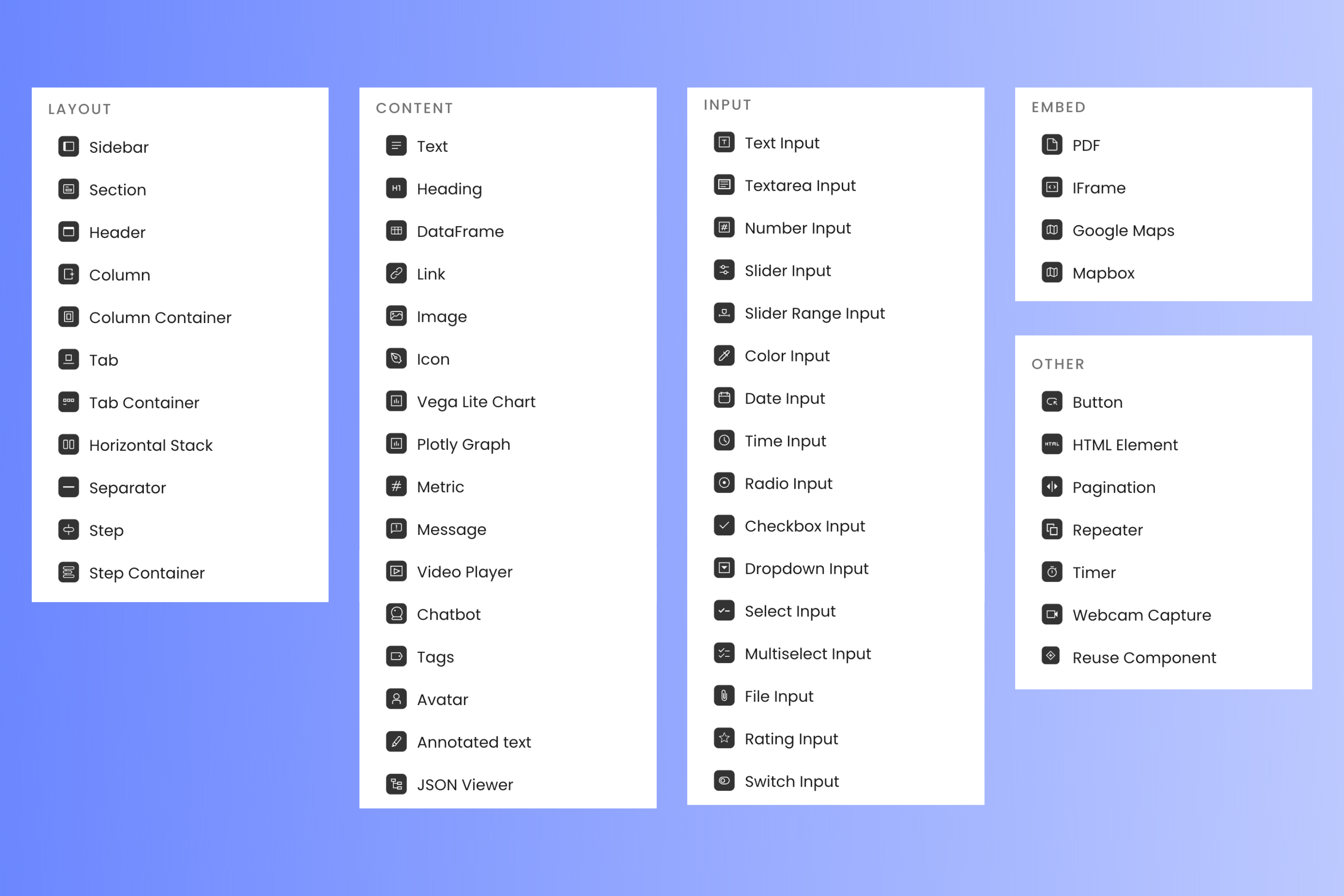
Discovering components
The Builder is designed to allow easy discoverability of components. Rather than scouring specifications every time you need to use a component, you can rely on the visual editor to guide you.- Short description: You can hover on the component type to get a tooltip with a short description.
- Available properties and events: Looking at Settings will allow you to see which of its properties are configurable.
- Built-in docs: Components have short docs built into them. You can expand it by clicking the help icon in Settings.
- Event handler stub code: Different events need to be handled differently. The built-in stub handlers, which can be found next to each event, can help you get started when writing event handlers.
Selecting and editing components
To move or edit a component in your UI, you need to select it first. You can do this by clicking on the component either in the Canvas or in the Component tree. The selected component will be highlighted in both the Canvas and Component tree.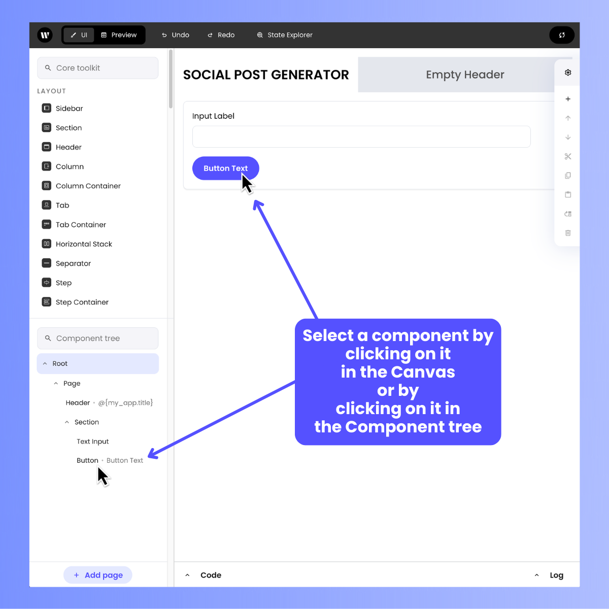
Basic settings
Basic settings
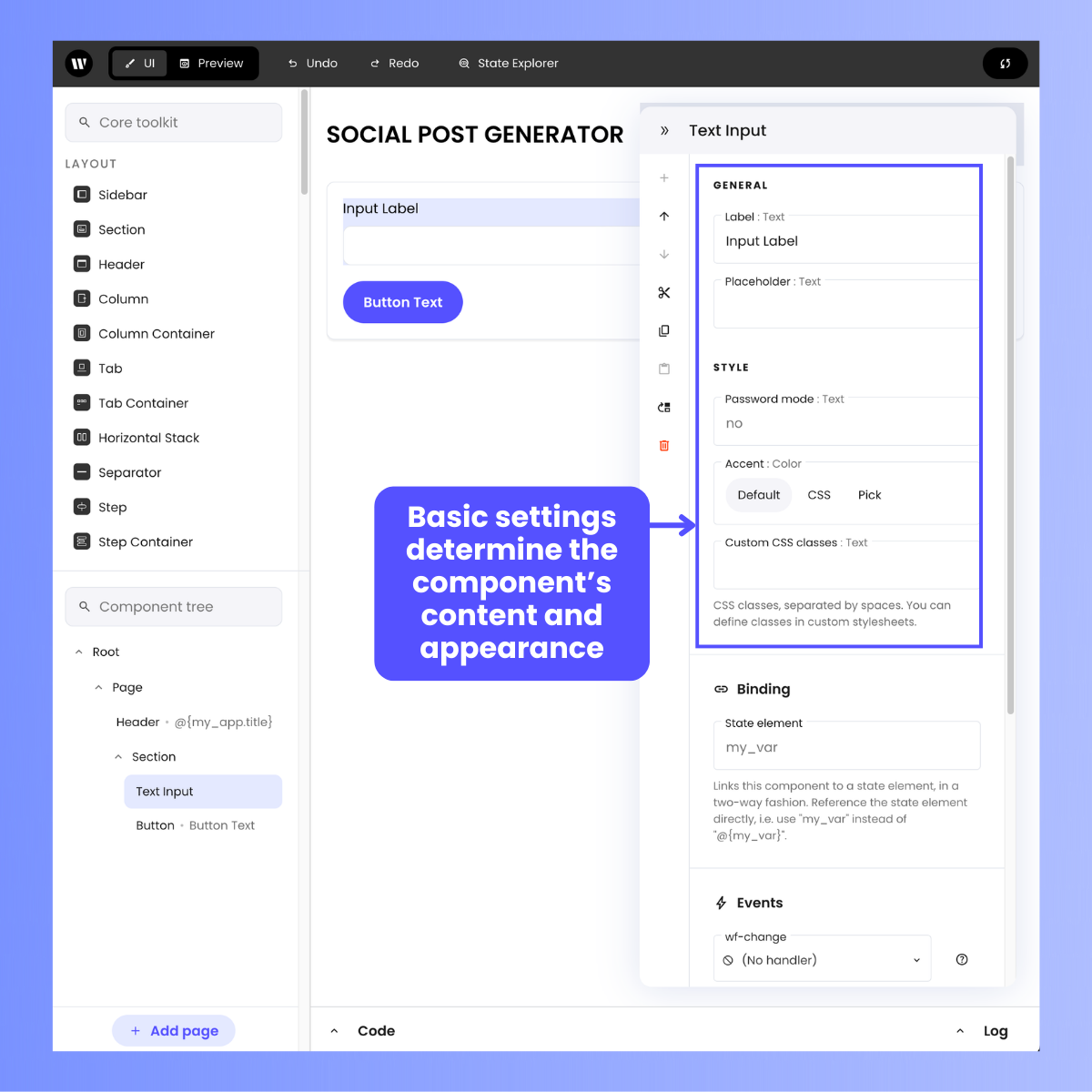
- General, which specifies the component’s content
- Style, which defines the component’s appearance.
- Literals, e.g.
monkey - References to application state using the template syntax
@{}, e.g.@{my_favourite_animal}. - A combination of both, e.g.
My favourite animal is @{my_favourite_animal}. - Nested states can be accessed with
.(dot), e.g.@{building.height}. - Nested elements can be dynamically accessed with
[], e.g.@{building[dynamic_prop]}will be equivalent to@{building.height}whendynamic_propequalsheight.
Binding
Binding
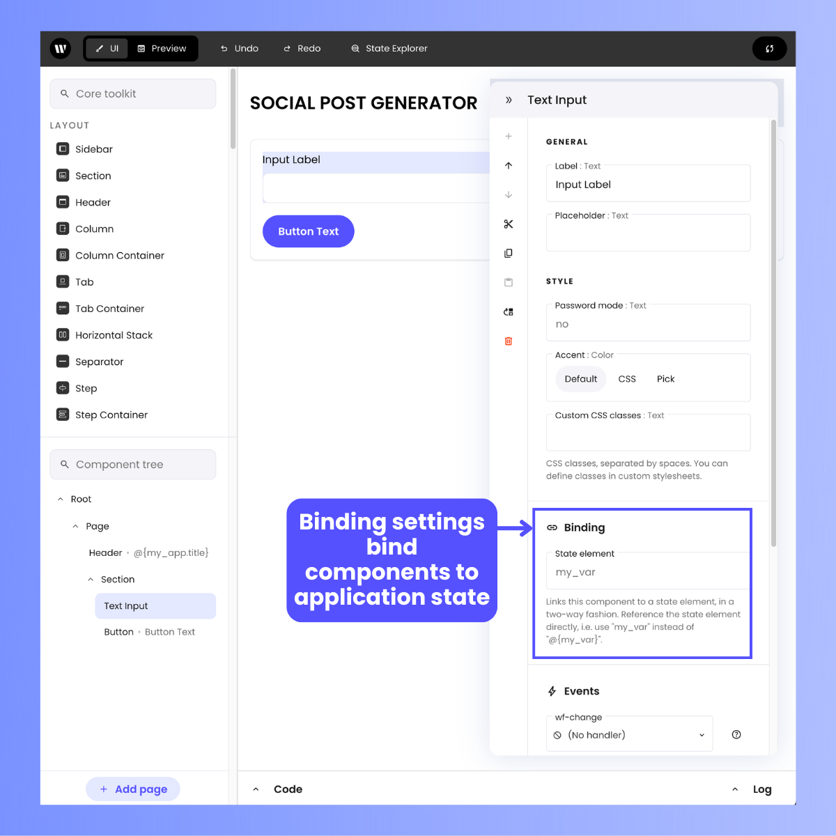
my_var. If the value of the slider changes, so does the value of my_var. Similarly, if the value of my_var changes, the slider is moved automatically to reflect the change.To bind an input component, specify the state element. For example, my_var or building.height. Note that this field should not contain the template syntax, e.g. my_var and not @{my_var}.Events
Events
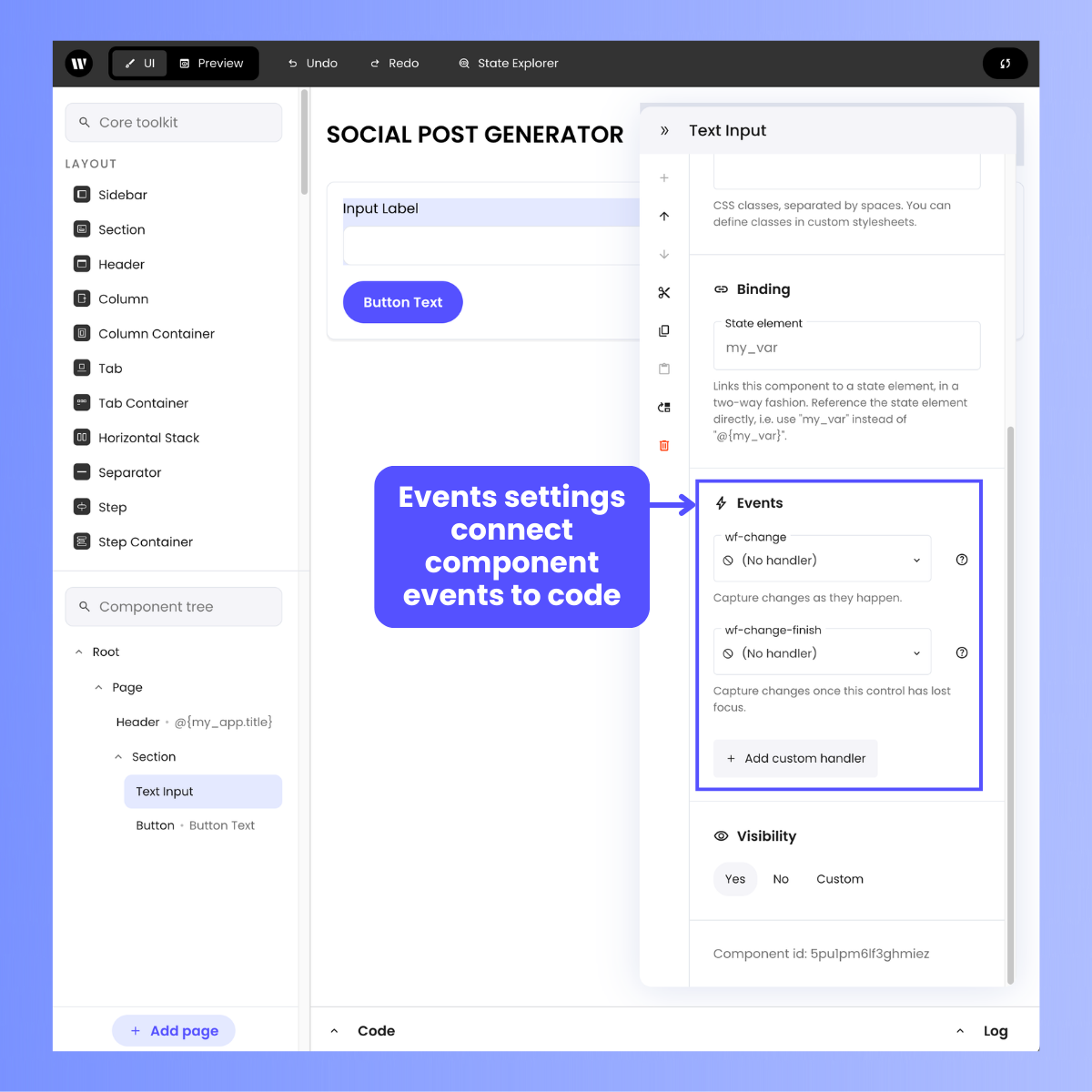
wf-change event, which occurs whenever the user changes the contents of the component.For more about event handlers, consult the Event handlers section of the Writer Framework documentation.Visibility
Visibility
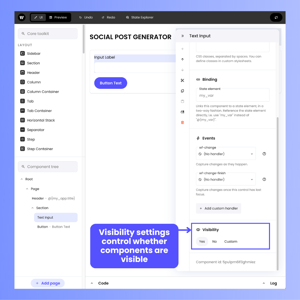
- Yes: The component is displayed.
- No: The component is not displayed. Note that hidden components are still part of the HTML code but aren’t shown.
- Custom: The component’s visibility depends on the value of a given state or context element. For example, if set to
my_var, visibility will depend on the value of themy_varstate element. Note that this field, similarly to Binding, should only contain the state element, e.g.my_varand not@{my_var}.
Component shortcuts
The Component shortcuts bar contains a set of options to perform various operations that are often performed on components.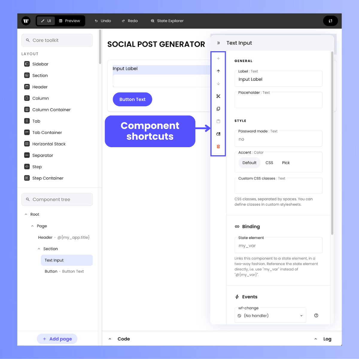
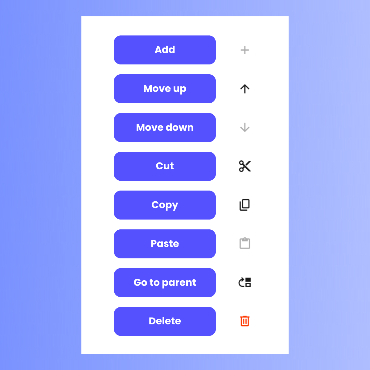
- Add: Adds a child of a specified type to the selected component.
- Move up: Decrements the position index of the selected component, used to sort children within the parent container.
- Move down: Increments the position index of the selected component.
- Cut: Cuts the selected component and places it in the clipboard.
- Copy: Copies the selected component to the clipboard.
- Paste: Pastes the content of the internal clipboard using the selected component as a parent.
- Go to parent: Selects the parent of the selected component.
- Delete: Deletes the selected component.
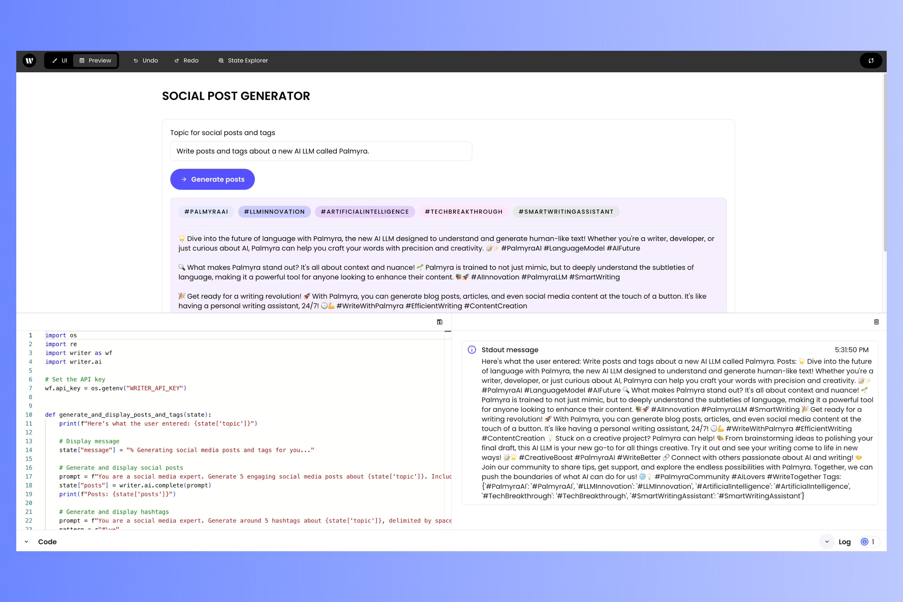
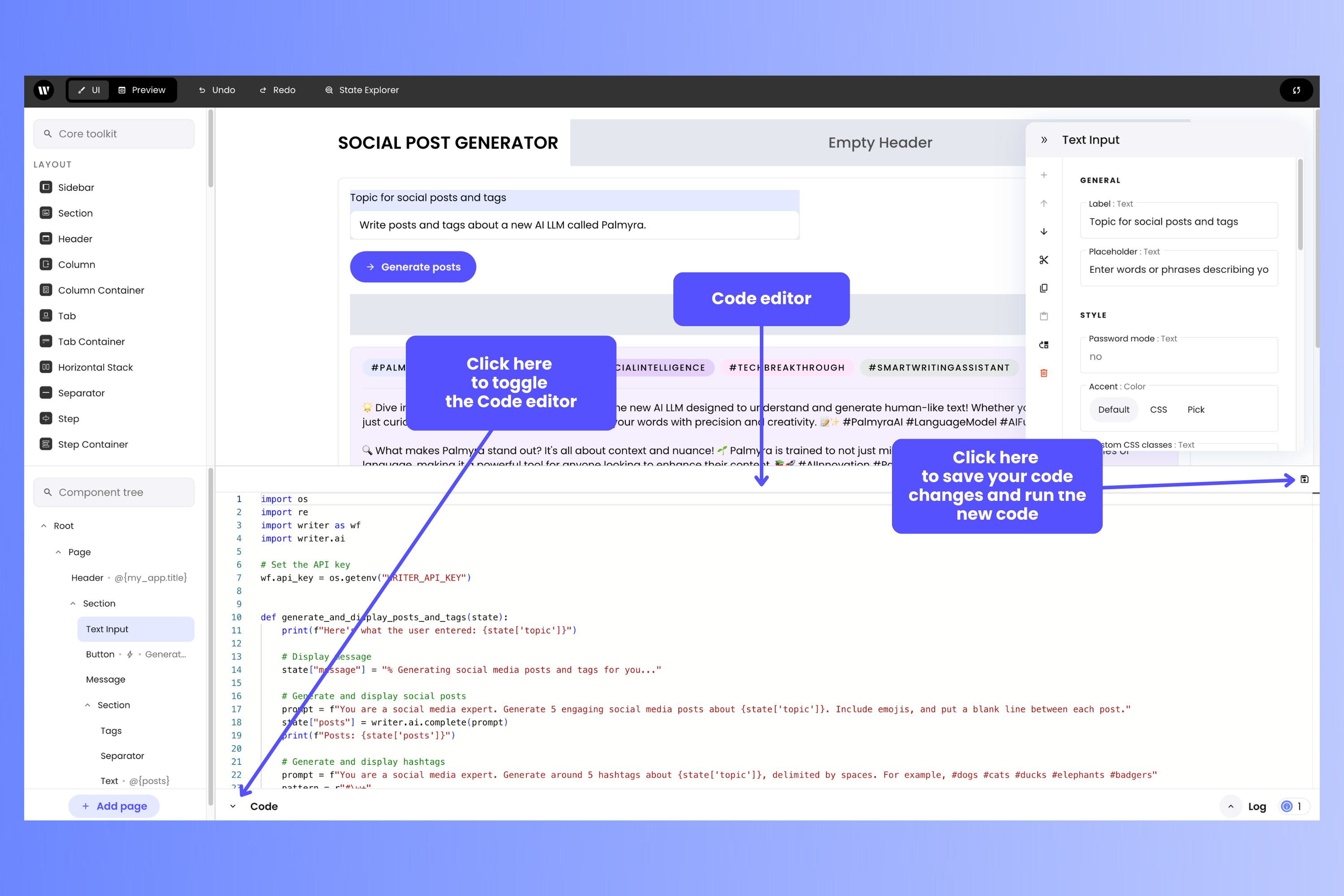
The Code editor and the Log
Writer Framework Builder provides a built-in Code editor for themain.py file, which defines the behavior of the app. You can toggle the Code panel by clicking the Code control near the lower left corner of the page:
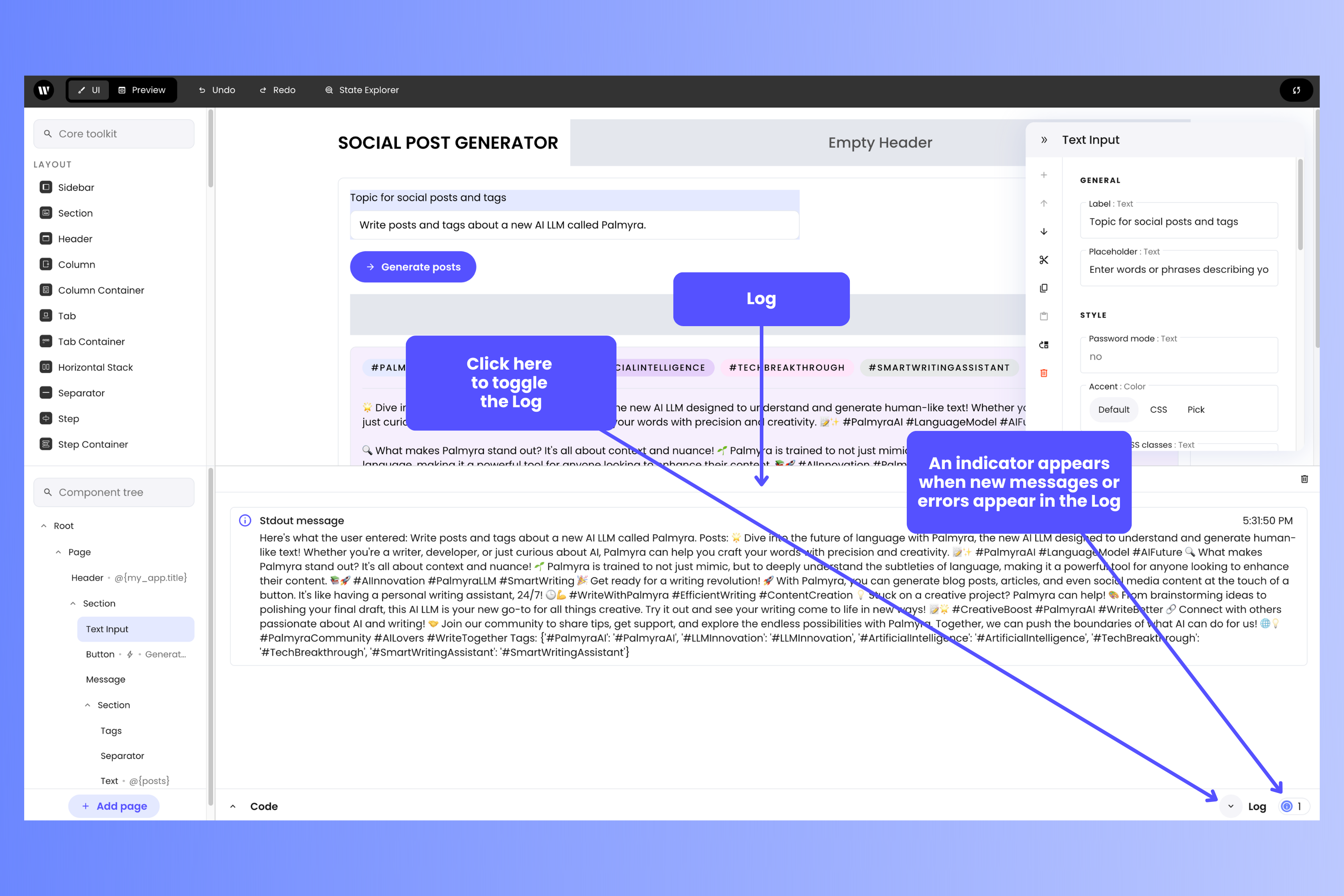
print() function, as well as any error messages. You can toggle the Log panel by clicking the Log control near the lower right corner of the page:
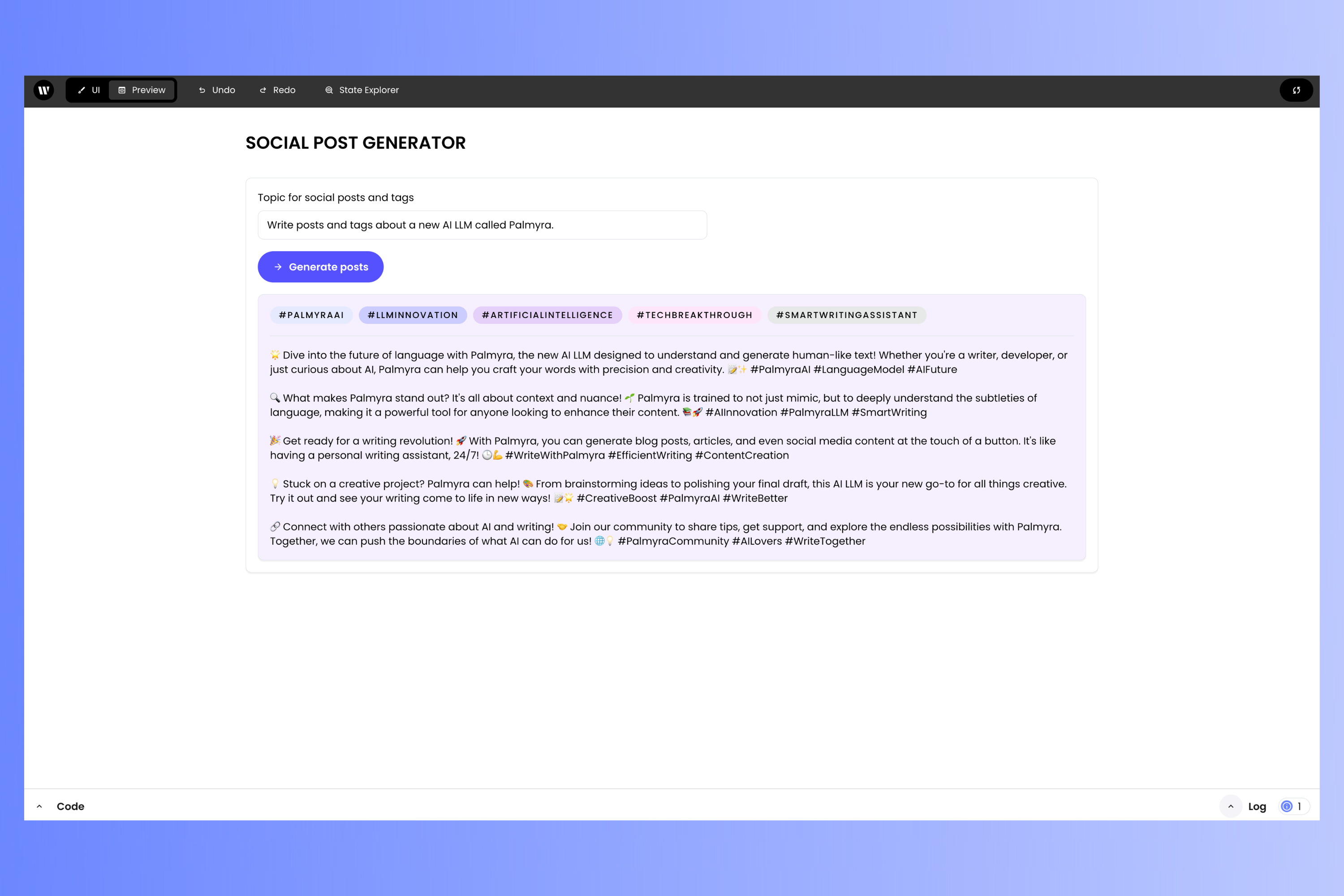
Testing your app in Preview mode
In Preview mode, the overlays that let you build the user interface — the Core toolkit, Component tree, and Component settings — are invisible and unavailable. You see the app almost as your users would see it; the Top bar and Bottom bar, which your users would not see, are still available to you in Preview mode.