> ## Documentation Index
> Fetch the complete documentation index at: https://dev.writer.com/llms.txt
> Use this file to discover all available pages before exploring further.
# Custom components
It's possible to extend Framework with custom component templates.
They're developed using Vue 3 and TypeScript. Once transpiled, they can be used by copying them to the `extensions/` folder of any project.
Custom components behave exactly like built-in ones. They are just as
performant, can contain other components, and offer the same the Builder
experience. They only differ from built-in components in the way that they're
bundled and imported.
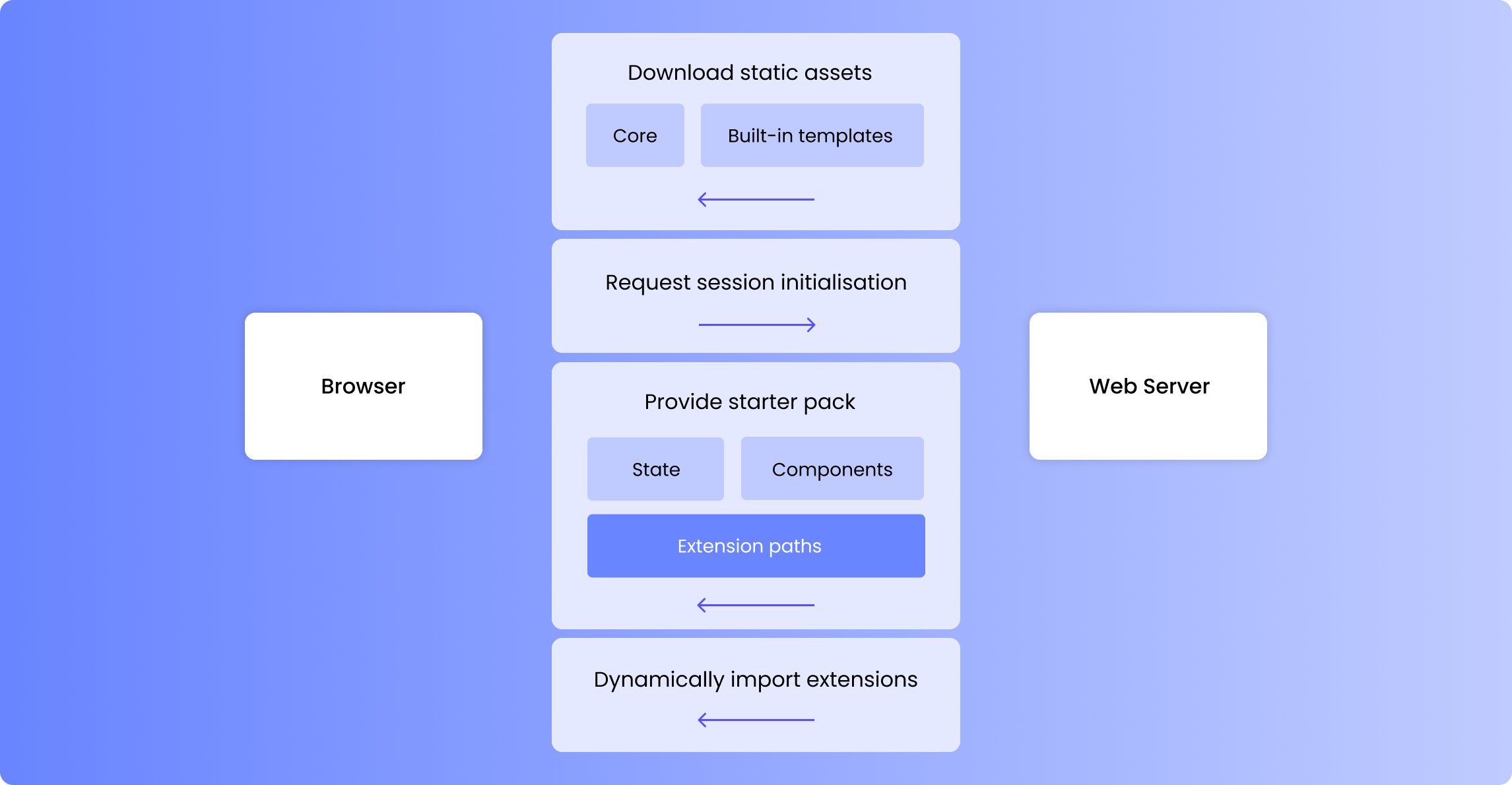
## Architecture
Framework front-end compiles to a collection of static assets that is distributed in the Python package. These static assets are then served via FastAPI.
During initialisation time, the server scans the `extensions/` folder in the project folder and looks for `.css` and `.js` files. This folder is also served, similarly to `static/`. If it finds any valid files in `extensions/`, it shares the list with clients and tells them to dynamically import these files during runtime.
Extensions and custom templates are currently synonyms, but this might change in order to accommodate other extension capabilities.
 Dependencies are [provided](https://vuejs.org/api/composition-api-dependency-injection.html) using injection symbols and can be *injected* to be used by the component template. These include `evaluatedFields`, which contain the current values of the editable fields. Injected dependencies are fully typed, making development easier.
[Rollup's external feature](https://rollupjs.org/configuration-options/#external), invoked via Vite, allows for extensions to be compiled without dependencies and link those during runtime. Therefore, extensions aren't bundled to be standalone, but rather to work as a piece of a puzzle.
Dependencies are [provided](https://vuejs.org/api/composition-api-dependency-injection.html) using injection symbols and can be *injected* to be used by the component template. These include `evaluatedFields`, which contain the current values of the editable fields. Injected dependencies are fully typed, making development easier.
[Rollup's external feature](https://rollupjs.org/configuration-options/#external), invoked via Vite, allows for extensions to be compiled without dependencies and link those during runtime. Therefore, extensions aren't bundled to be standalone, but rather to work as a piece of a puzzle.
 ## Anatomy of a template
A template defines how a certain component is rendered. For example, `corebutton` defines how *Button* components are rendered.
Framework component templates are purely front-end. They are Vue 3 templates that extend the Vue specification via a [custom option](https://vuejs.org/api/utility-types.html#componentcustomoptions), `writer`. This custom option defines all the Framework-specific behaviour of the component. For example, its `fields` property establishes which fields will be editable via the Builder.
### Simple example
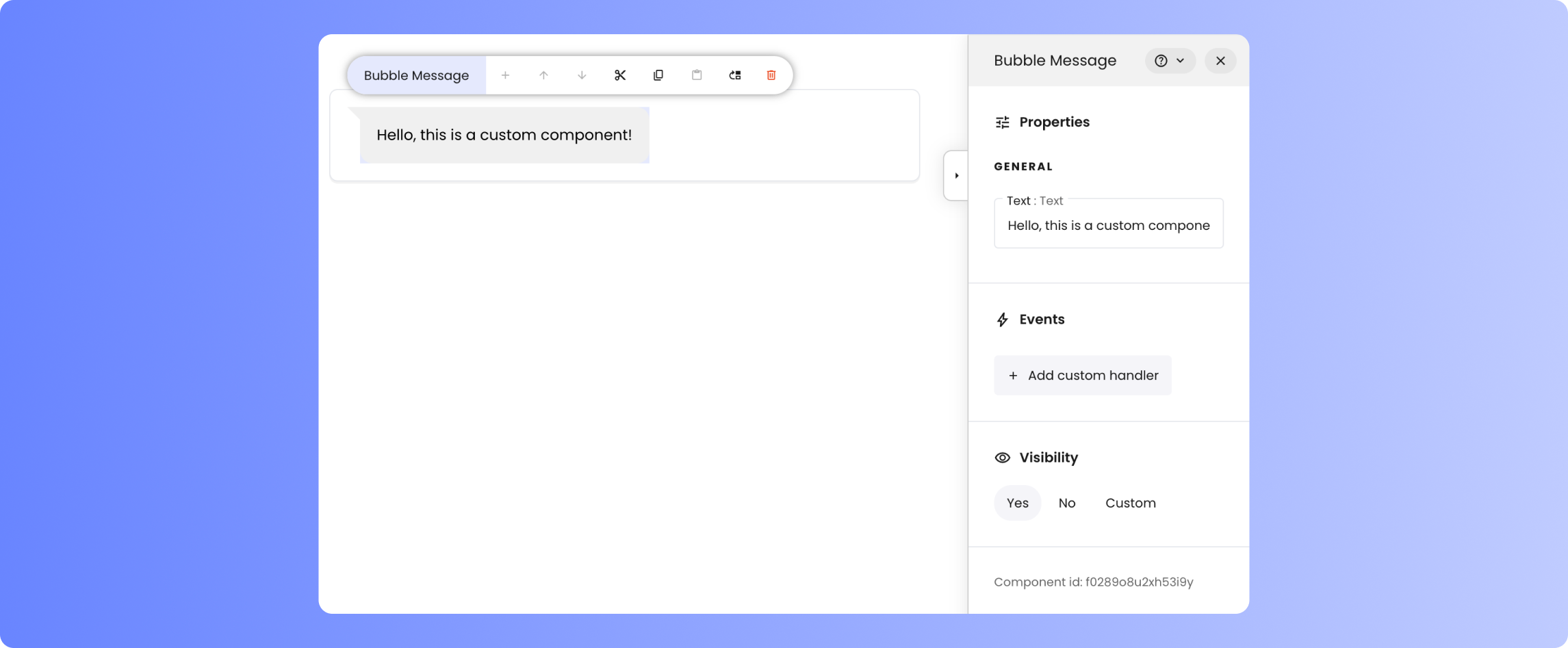
This example shows a template for *Bubble Message*, a simple demo component with one editable field, `text`.
```js theme={null}
```
The code above will make Bubble Message available in the Builder.
## Anatomy of a template
A template defines how a certain component is rendered. For example, `corebutton` defines how *Button* components are rendered.
Framework component templates are purely front-end. They are Vue 3 templates that extend the Vue specification via a [custom option](https://vuejs.org/api/utility-types.html#componentcustomoptions), `writer`. This custom option defines all the Framework-specific behaviour of the component. For example, its `fields` property establishes which fields will be editable via the Builder.
### Simple example
This example shows a template for *Bubble Message*, a simple demo component with one editable field, `text`.
```js theme={null}
```
The code above will make Bubble Message available in the Builder.
 ## Developing templates
### Run a local server
To get started, clone the [Framework
repository](https://github.com/writer/writer-framework) from GitHub.
To develop custom templates in a developer-friendly way, ensure you have a
front-end development server with instant reload capabilities. The front-end
code for Framework is located in the `ui` folder. With Node and npm
installed on your system, run `npm install` to install dependencies. Then,
start the server with support for custom component templates using `npm run
custom.dev`.
```sh cd ui npm install # "custom.dev" links templates in theme={null}
"custom_components/" # "dev" runs the server without them npm run custom.dev
```
The command `npm run custom.dev` starts a front-end server, which requires a
back-end to function fully. Start Framework via command line, specifying the
option `--port 5000`, to provide a back-end on that port. It's recommended
to create a new app for testing the template you're developing. `sh writer
create customtester writer edit customtester --port 5000 `
You should now be able to access Framework via the URL provided by Vite,
e.g. `http://localhost:5174`. In the Builder's *Toolkit*, you should see the
sample component, *Balloon Message*. Add it to your tester application.
### Create a new component
You can also have a look at the built-in component templates, since their
syntax is equivalent. They can be found in the `ui/src/components/core` folder.
Go to `ui/src/components/custom` and open the Vue single-file components, i.e. the
`.vue` files. These files contain comments that will help you get started. Try editing
the provided templates, you should see changes reflected.
You can get started by duplicating one of these examples. Make sure you add the new template to the entrypoint, as discussed below.
### Define entrypoint
For custom component templates to be taken into account, they need to be accessible from the entrypoint. Edit `ui/src/components/custom/index.ts` to define which templates you wish to export and under which identifiers.
```ts theme={null}
// Import the templates
import BubbleMessage from "./BubbleMessage.vue";
import BubbleMessageAdvanced from "./BubbleMessageAdvanced.vue";
// Export an object with the ids and the templates as default
export default {
bubblemessage: BubbleMessage,
bubblemessageadvanced: BubbleMessageAdvanced,
};
```
A single or multiple templates can be specified. Take into account that they will all be exported, and later imported, together.
## Bundling templates
Execute `npm run custom.build` into `src/ui`, this will generate the output `.js` and `.css` files into `./custom_components_dist`.
```sh theme={null}
# "build" builds the entire front-end
# "custom.build" only builds the custom templates
npm run custom.check # Optional: checks certain issues on custom components
npm run custom.build
```
Collect the files from `./custom_components_dist` and pack them in a folder such as `my_custom_bubbles`. The folder containing the generated files, e.g. `my_custom_bubbles`, can now be placed in the `extensions/` folder of any Framework project. It'll be automatically detected during server startup.
The `custom.check` command is optional, but it's recommended to run it before building the custom components. It checks for common issues in the custom components, such as invalid key declaration, ...
## Developing templates
### Run a local server
To get started, clone the [Framework
repository](https://github.com/writer/writer-framework) from GitHub.
To develop custom templates in a developer-friendly way, ensure you have a
front-end development server with instant reload capabilities. The front-end
code for Framework is located in the `ui` folder. With Node and npm
installed on your system, run `npm install` to install dependencies. Then,
start the server with support for custom component templates using `npm run
custom.dev`.
```sh cd ui npm install # "custom.dev" links templates in theme={null}
"custom_components/" # "dev" runs the server without them npm run custom.dev
```
The command `npm run custom.dev` starts a front-end server, which requires a
back-end to function fully. Start Framework via command line, specifying the
option `--port 5000`, to provide a back-end on that port. It's recommended
to create a new app for testing the template you're developing. `sh writer
create customtester writer edit customtester --port 5000 `
You should now be able to access Framework via the URL provided by Vite,
e.g. `http://localhost:5174`. In the Builder's *Toolkit*, you should see the
sample component, *Balloon Message*. Add it to your tester application.
### Create a new component
You can also have a look at the built-in component templates, since their
syntax is equivalent. They can be found in the `ui/src/components/core` folder.
Go to `ui/src/components/custom` and open the Vue single-file components, i.e. the
`.vue` files. These files contain comments that will help you get started. Try editing
the provided templates, you should see changes reflected.
You can get started by duplicating one of these examples. Make sure you add the new template to the entrypoint, as discussed below.
### Define entrypoint
For custom component templates to be taken into account, they need to be accessible from the entrypoint. Edit `ui/src/components/custom/index.ts` to define which templates you wish to export and under which identifiers.
```ts theme={null}
// Import the templates
import BubbleMessage from "./BubbleMessage.vue";
import BubbleMessageAdvanced from "./BubbleMessageAdvanced.vue";
// Export an object with the ids and the templates as default
export default {
bubblemessage: BubbleMessage,
bubblemessageadvanced: BubbleMessageAdvanced,
};
```
A single or multiple templates can be specified. Take into account that they will all be exported, and later imported, together.
## Bundling templates
Execute `npm run custom.build` into `src/ui`, this will generate the output `.js` and `.css` files into `./custom_components_dist`.
```sh theme={null}
# "build" builds the entire front-end
# "custom.build" only builds the custom templates
npm run custom.check # Optional: checks certain issues on custom components
npm run custom.build
```
Collect the files from `./custom_components_dist` and pack them in a folder such as `my_custom_bubbles`. The folder containing the generated files, e.g. `my_custom_bubbles`, can now be placed in the `extensions/` folder of any Framework project. It'll be automatically detected during server startup.
The `custom.check` command is optional, but it's recommended to run it before building the custom components. It checks for common issues in the custom components, such as invalid key declaration, ...