| Label |
Text |
- |
-
|
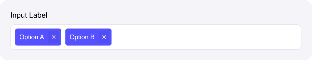
| Options |
Key-Value |
Key-value object with options. Must be a JSON string or a state reference to a dictionary. |
-
|
| Placeholder |
Text |
Text to show when no options are selected. |
-
|
| Maximum count |
Number |
The maximum allowable number of selected options. Set to zero for unlimited. |
-
|
| Accent |
Color |
The colour of the chips created for each selected option. |
-
|
| Chip text |
Color |
The colour of the text in the chips. |
-
|
| Primary text |
Color |
- |
-
|
| Container background |
Color |
- |
-
|
| Separator |
Color |
- |
-
|
| Custom CSS classes |
Text |
CSS classes, separated by spaces. You can define classes in custom stylesheets. |
-
|
 ## Fields